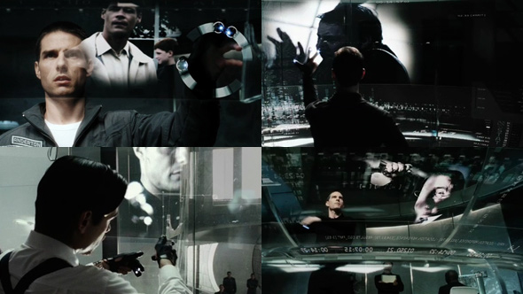
Minority Report UI
To me personally, Minority Report was a real game changer. It was an exciting look into the future with a tonne of great interfaces and imaginary technology. It turns out that Microsoft Research, MIT, and several design studios all worked on the interface designs found in the film.
The visuals used in the interfaces were beautiful and represented information so elegantly. I especially like the wheel device that appears as Tom Cruise uses a rotate motion. The way the visuals moved with the gestures were a highlight, a key factor in making the gestural interface look convincing. What’s also lovely is how the graphical elements are displayed on a huge clear curved surface, which really takes us away from the norm of interfacing on small, housed screens. It’s quite a clever way of showing the interface graphics, while also showing the facial reactions of the A-list stars.
Watch the Minority Report clip here (courtesy of www.asylumfx.com)
Since the film’s release, researchers have been working towards recreating the technology. Here’s a few links to some of the more exciting examples.
See-through touch screens
Using gloves and sensors
Kinect hack

