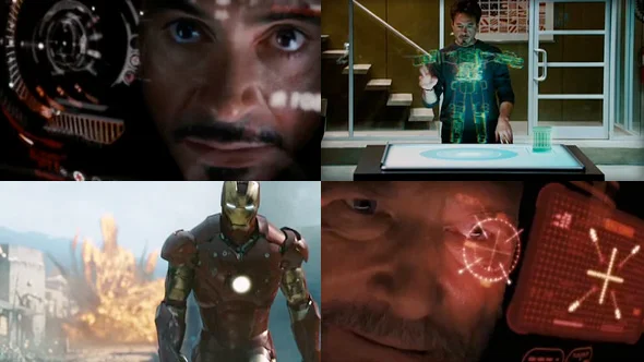
Iron Man HUD part 1
I'd imagine it'd be a dream come true for some designers, to be tasked with designing the HUDs and GUIs for Iron Man. Apart from the fact that Iron Man is one of the most iconic characters in the Marvel universe, his suit is supposed to house the most advanced technology imaginable.
The Front and The Orphanage (now shut down) did a wonderful job at bringing Tony Stark's inventions to life. The designs are visually rich and full of colour and detail. There are two major interface components in the film, the holographic prototype table and the Iron Man suit HUD.
I am a big fan of the idea of 3D holographic interfaces, as they take the interface and remove it from the boundaries of screens and surfaces and brings it into the space of the user. The scene where Tony is prototyping his suit design on the holographic table is one of my favourite examples of interface design. I've touched on the advantages of holographic interfaces in my previous post on Avatar, although this film came out a year before. Also Iron Man takes the interface to another level, where Tony is able to physically interact with the holographic model using his hands. This really blew me away. The part where Tony tries on the virtual glove is equally amazing, I could only imagine the possibilities with this type of interface.
Not to be overshadowed, is the brilliant HUD design of the Iron Man suit. Each HUD has been designed with the utmost attention to detail and I feel may have provided a good reference for the also superb HUD in District 9. Tony wears two suits in the film and each HUD has its unique colour scheme. But you will notice that all elements created by Tony Stark share a distinct design style whereas his enemy's suit is of a different style altogether. The graphical elements in the displays are expertly crafted and the overall visual beauty of them is a joy to see. You have to see it for yourself.

