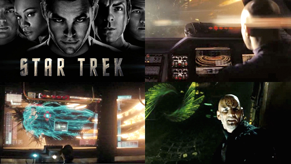
Star Trek - UI Design
I can't really say I'm a Star Trek fan (I prefer Star Wars myself), but I was pleasantly surprised by this movie, which also happened to feature some nice interface designs. Most of them appear as either screen displays in the ships or touchscreen devices, with the exception of one short clip featuring Eric Bana behind a hologram.
There were two things that really caught my eye. One was that I really liked the design of the interfaces in the villain's ship. I liked all the interesting shapes they used and the predominantly green colour scheme, all of which helped differentiate them from the good guys.
The other thing I noticed was this 'folded rectangle' shape they used in some of the good guys' displays, which is like a rectangle with the top left corner cut off (similar to the shape of a sim card). I remember a time when this was all the rage. It's funny how quickly this shape became associated with all things futuristic and hi-tech. But now I think we're moving away from that and the 'folded rectangle' is quickly becoming dated.
There's a lot separately clips here showing a nice range of UI designs. Enjoy!

