Mission Impossible 4 - UI Design
The great thing about spy films is that it usually features lots of cutting edge/futuristic technology, and Mission Impossible: Ghost Protocol is no exception.
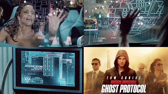
Two of the more interesting gadgets would have to be the computerized contact lenses and the car UI.
The concept of the computerized contact lenses is a lot like Google's Project Glass, whereby information is displayed in relation to the wearer's field of view. In this case though, it's all contained in a tiny contact lens so that agents can wear them discretely.
In terms of the car UI, as cool as it looked, it doesn't seem to be very feasible. My initial thought was that with most car UIs, safety is one of the highest of priorities but then realized that safety probably wasn't at the top of the list for Mission Impossible Agents after seeing all the crazy things that Tom Cruise does.
I like the idea of graphics projected onto windscreens as long as it wasn't obtrusive. For some time, people have been experimenting with projected speedometers and the like, but it's the first time I've ever seen it as a touch screen. Which to me, kind of seems a bit distracting and you can also see the actress straining to reach the glass.
GM recently explored this idea for rear passengers, which to me feels much more feasible and a more appropriate application. Perfect for kids on long road trips.
Regardless, it's always fun to explore new ideas without having to worry too much about how it would work. There's plenty of other areas where you cannot afford to have this freedom, and it's one of the things I really like about UI in films, and fictional UIs.
There's still plenty of references and inspiration in the clip.
Check out the UI Design in Mission Impossible 4 - Ghost Protocol

