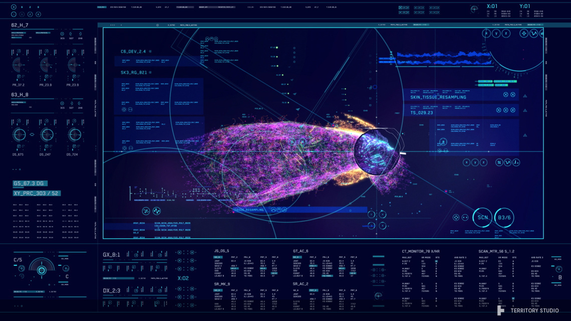
Avengers: Age of Ultron UI by Territory Studios
Territory Studios (Guardians of the Galaxy, Jupiter Ascending) have just released a UI reel showcasing their work on Avengers: Age of Ultron. It's really well put together, showing lots of great closeups of the details and animations. It's a quick summary of the enormous amount of work produced for the film, which included over 200 screens / animations, totalling to 80 minutes worth of unique animations.
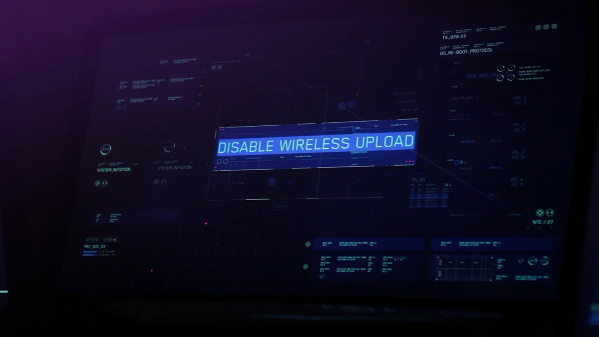
In it you can see the clear distinction between environments, overall the approach to the elements are quite similar but the design and colour schemes vary deliberately between the different characters.
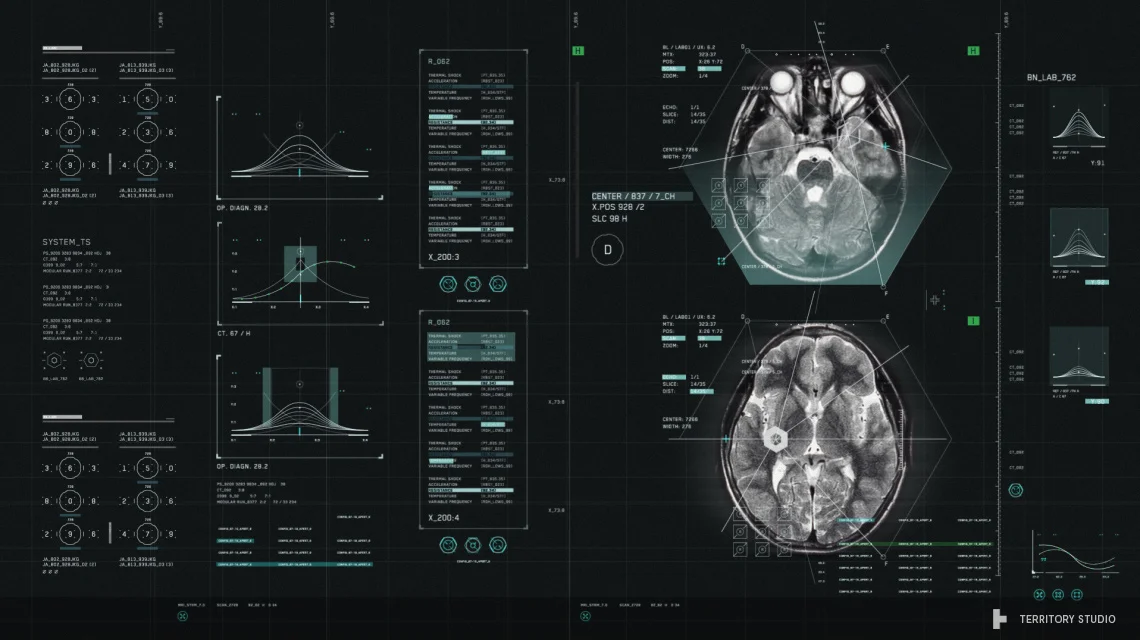
Lucky for us, Territory have also shared a host of videos and images that allows us to have a closer look at how some of the shots work.
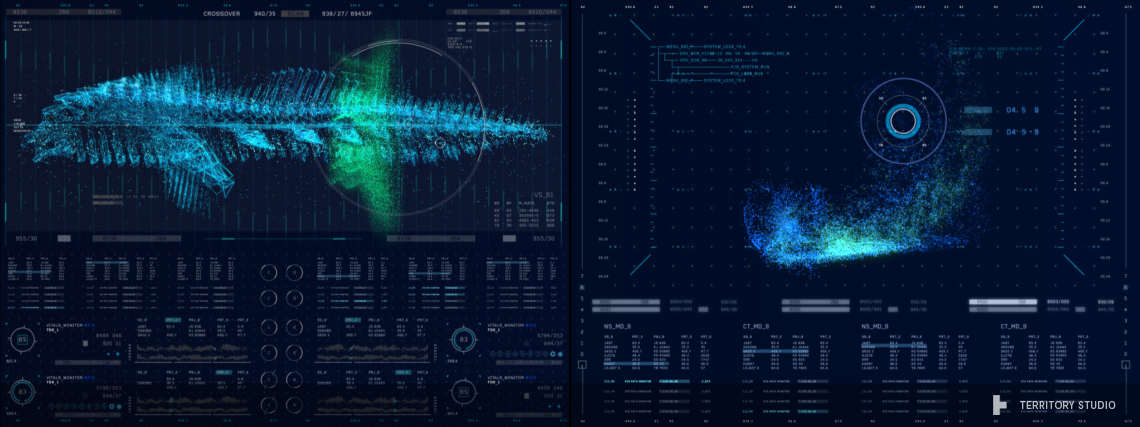
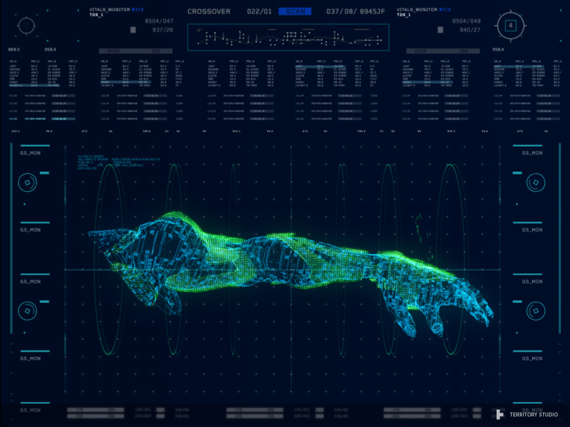
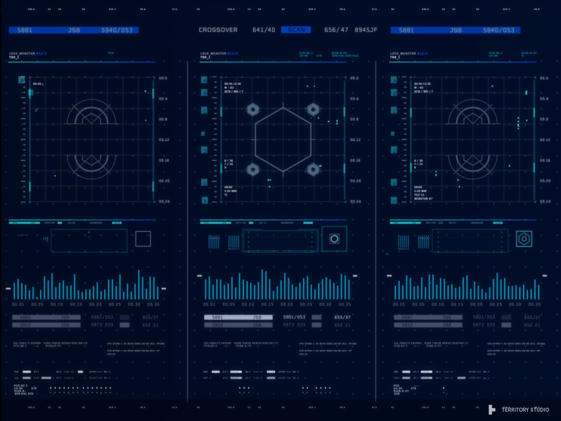
My favourite would have to be the Fortress UI. I love the scanning animation that goes across the arm diagram in the second Fortress clip below. The arm itself looks great with the flickering patches of green and the subtle circular outlines framing it. I like the idea of the overlapping sections in the third Fortress clip too. It looks as though zooming into the section reveals detailed diagrams relating to that specific area and zooming out allows you to see a broader context of it overlaid on another section. I think that's a really neat idea and visually interesting too.
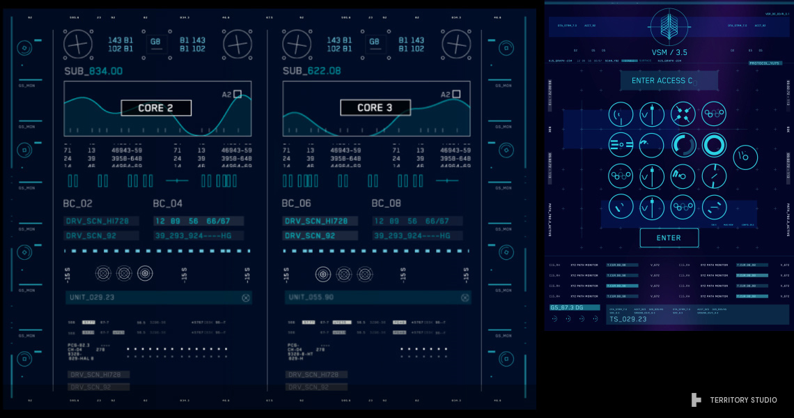
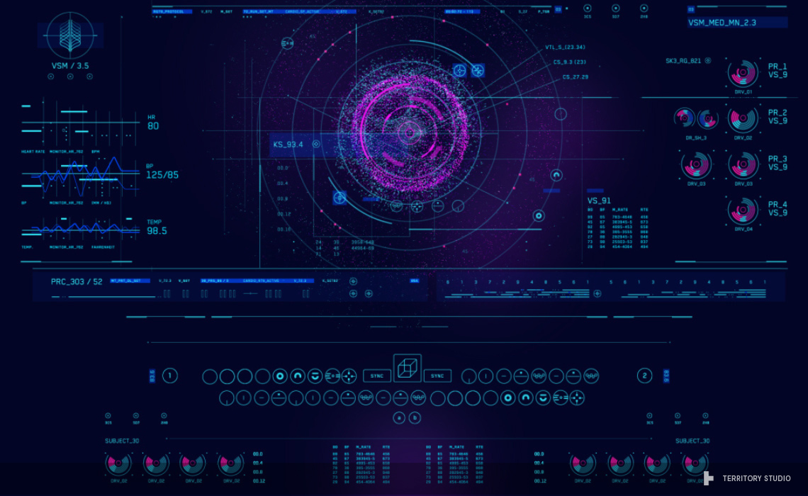
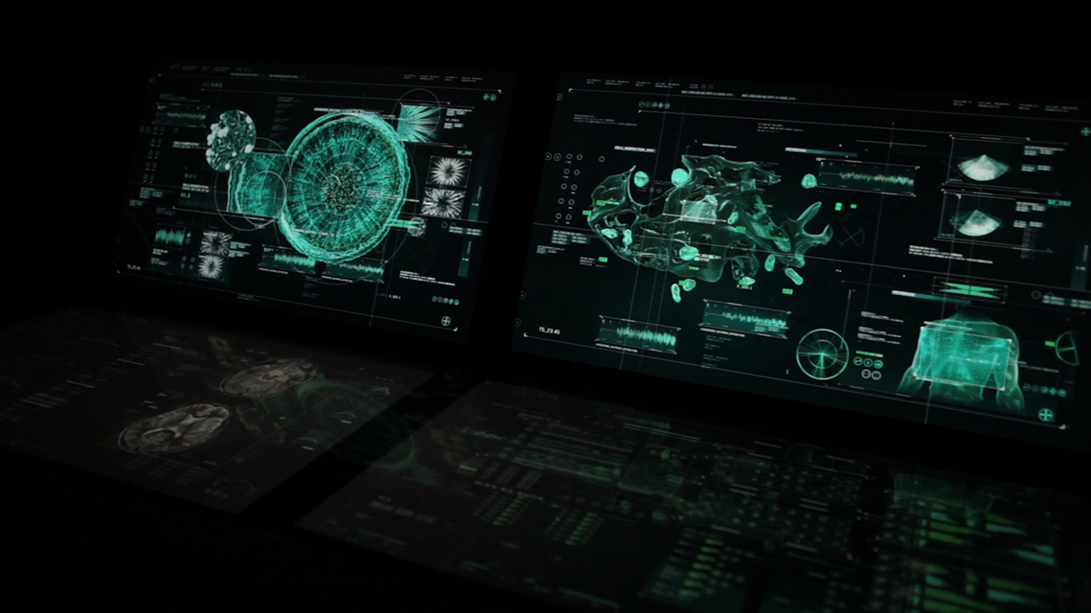
Closely followed by Dr Cho's UI because of the vibrancy of the colours. Everything has a wash of blue over it, with highlights of magenta and a deep blue, there doesn't seem to be any hints of true black or white. I also love the way the table layout works in the first Dr Cho clip. It looks authentic and feels scientific, you can easily imagine what each of those cells could represent, for me it looks like something to do with DNA or chemical levels, and that gives it enough of an illusion of realism for me. The body scan in third Dr Cho clip also stood out. I like that the body is made up of many fine lines. It makes me think that it's using state of the art equipment, because of the speed of which the scan wipes over the body and how it's able to scan all that detail and even speed up toward the end of the process, even though I don't even know what any of those lines represent.
Have a good look, there's so much work here, which has been done over a long period of time.
Congrats to Territory Studio on such a mammoth project and a big thank you for sharing!
Dr Cho UI
Banner UI
Stark UI
Fortress UI
Leviathan Lab
Images
Also check out this interview with David Sheldon-Hicks, creative director and found of Territory Studio over at Inventing Interactive.


