Boeing 100 - UI Design
Here is a video piece created to celebrate the 100th anniversary of Boeing. Though this project is not exactly an example of an interface design, it does provide inspiration that's very relevant. The video showcases some beautiful imagery and examples of data visualisation, simulations, and infographics.
The overall theme and design style is based on a digital-simulation look with references to blueprints and wireframes. If this design style was applied to an interface, it would create a look that would be suitable to a very advanced UI and something scientific or mathematical.
The design is beautiful, you can pause the video at any point and be presented with a visually stimulating frame. The key outtakes would be the blueprint designs, the wireframing and the background information noise.
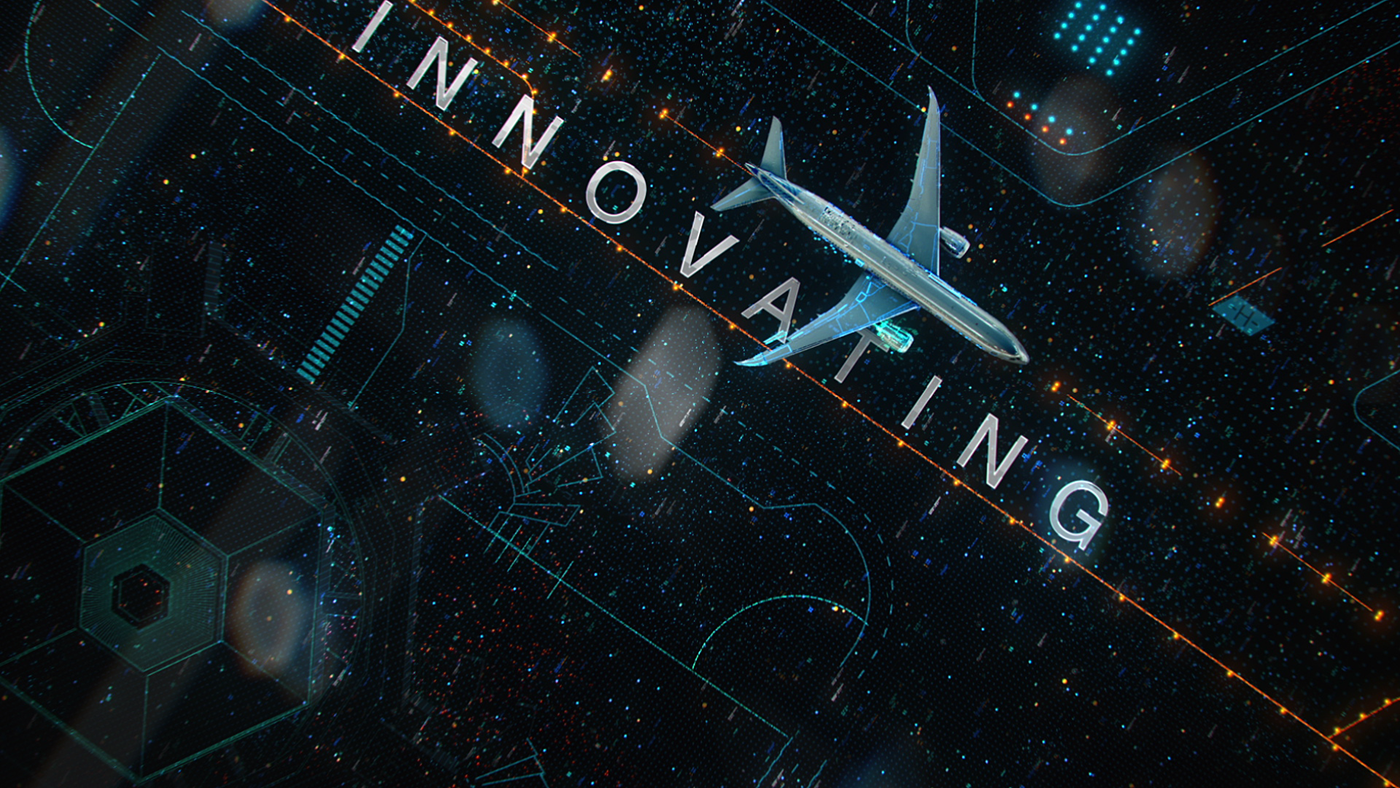
Blueprint design
This just looks stunning! I really love clean shapes created by the thin lines and varying line weights. Adding the shallow depth of field may have helped a lot too. We often see simulations in FUI design, but this is one of the most visually attractive examples I've seen. Perhaps it's because it doesn't just look like the basic shaded version of a 3D model, and instead is treated like a blueprint illustration. This really caught my eye.
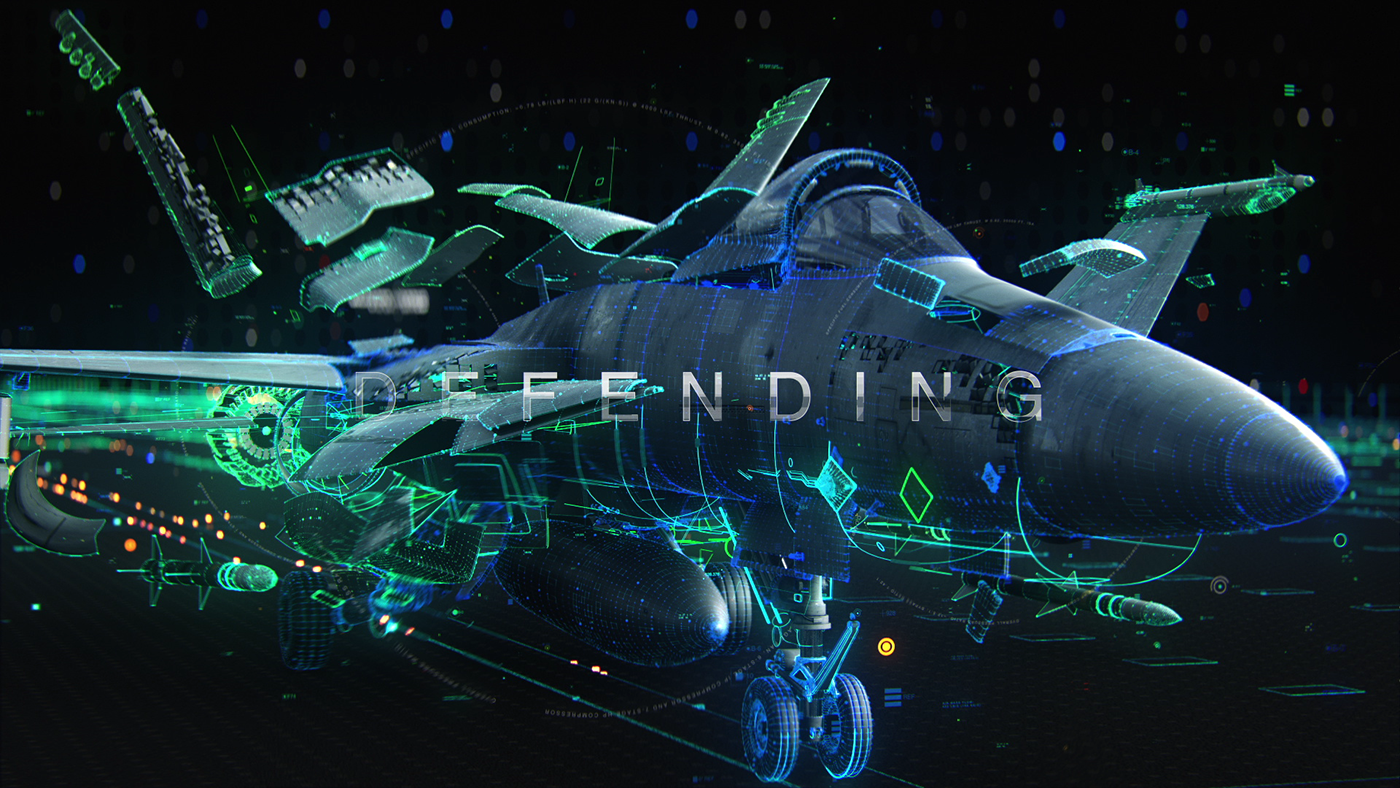
Wireframing
This also blew me away! Having these beautifully detailed 3D models overlaid with these thin glowing wireframe outlines created such vibrant and visually rich images. It probably helps that the aircrafts have such lovely contours and complex shapes. The fighter jet shots are by far my favourite. The colour choices are worth mentioning too, they're nicely saturated and they complement each other well.
Background information noise
Here I'm referring to the background noise, the little dots and marks scattered around the screen. They help create the illusion of complexity, you can imagine each one holding lots of detailed information, that you just can't see because they're so far away. Besides adding to the aesthetics of the completed shot, they also offer information about space and depth. I think this was an excellent addition and really completed the look.
Image gallery
Congrats to the team for an awesome project! Look forward to seeing more :)
Credits
Client: Boeing
Production Co / VFX: Aggressive / Loop
Creative Directors: Alex Topaller, Dan Shapiro, Alex Mikhaylov
Executive Producer: Dan Shapiro
Art Director & Design: Alex Mikhaylov
CG Supervisor: Max Chelyadnikov
Modeling: E.D.Satan, Valentine Sorokin, Roman Senko
2D Animation: Vladimir Tomin, Alex Frukta
3D Animation: Dmitriy Paukov, Roman Senko
Editing: Dan Shapiro, Alex Mikhaylov
FX TD: Nikolay Lvov, Daniil Rybkin
Matte Painting: Dmitriy Ten
Rendering: Max Chelyadnikov
Compositing: Max Chelyadnikov, Roman Senko
Production Manager: Dustin Pownall
Storyboard Artist: Anton Antonov
Sound Design: Wesley Slover
Sound Design (Dir Cut): Echoic


