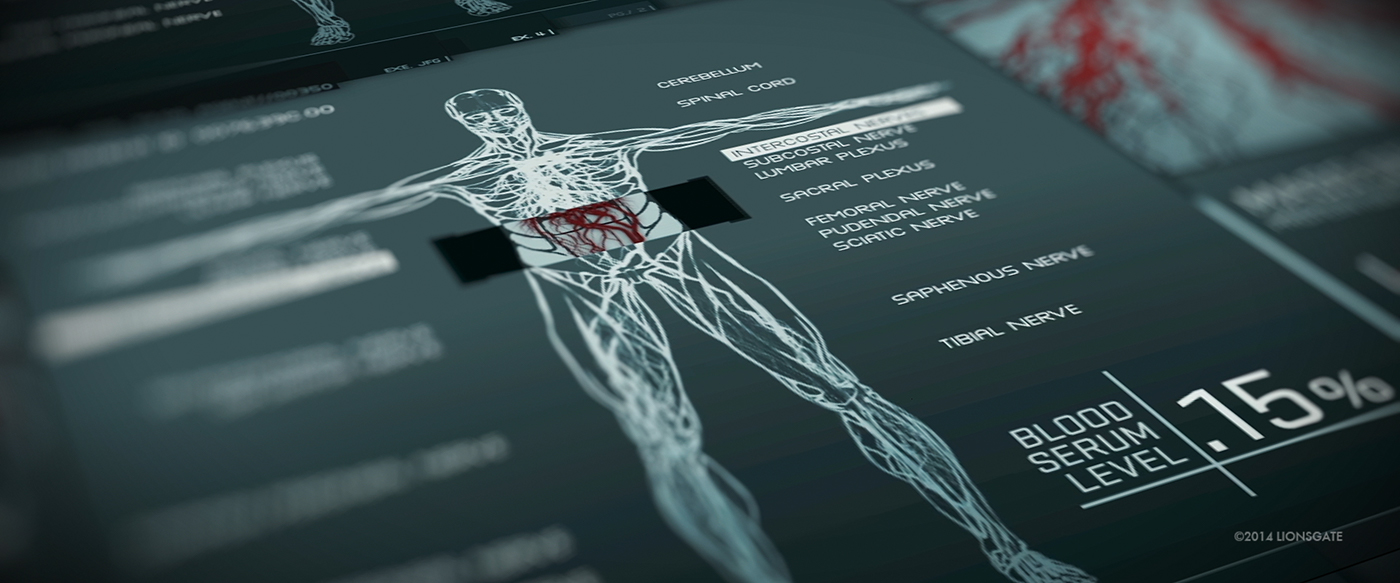
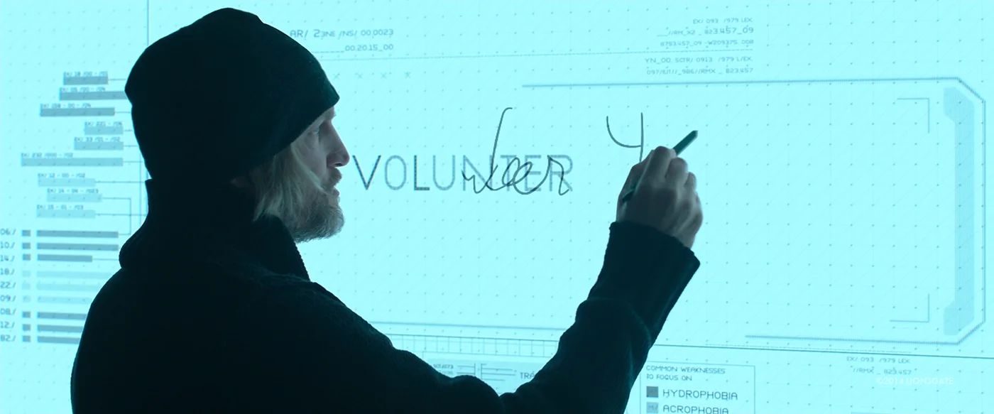
The Hunger Games - Mocking Jay UI by Cantina Creative
Cantina Creative have shared some of the work they did for The Hunger Games: Mocking Jay. There is an On-set GFX reel (above), an extensive behind the scenes video (below), as well as a VFX reel (further below).
The behind the scenes video is definitely worth watching. It provides a detailed walk-through of the work, and also offers useful insights into the thought process and challenges of such a project. The video is broken down into sections such as On-set GFX, playback GFX and interactive GFX. I really like their explanation of On-set graphics, that they should be considered part of the production design, and treated as a prop rather than a hero. They are not meant to be scrutinised from up close, but instead should be associated with the environment. This helps explain their approach to the design style, which preferred bold, bulkier designs over delicate details.
Cantina Creative were tasked to create a consistent design language to populate the screens within the base where everyone is hiding out (District 13). There are different areas to the base, which had their own style but overall it followed the same global language. The video used words like Soviet, Militia, Bauhaus and angular to describe the design, which sums it up well.
They've done an amazing job on this, and I definitely appreciate it even more after watching the behind the scenes video.
Check it out!
Ps. Keep an eye out for the HUDS+GUIS icon :)


