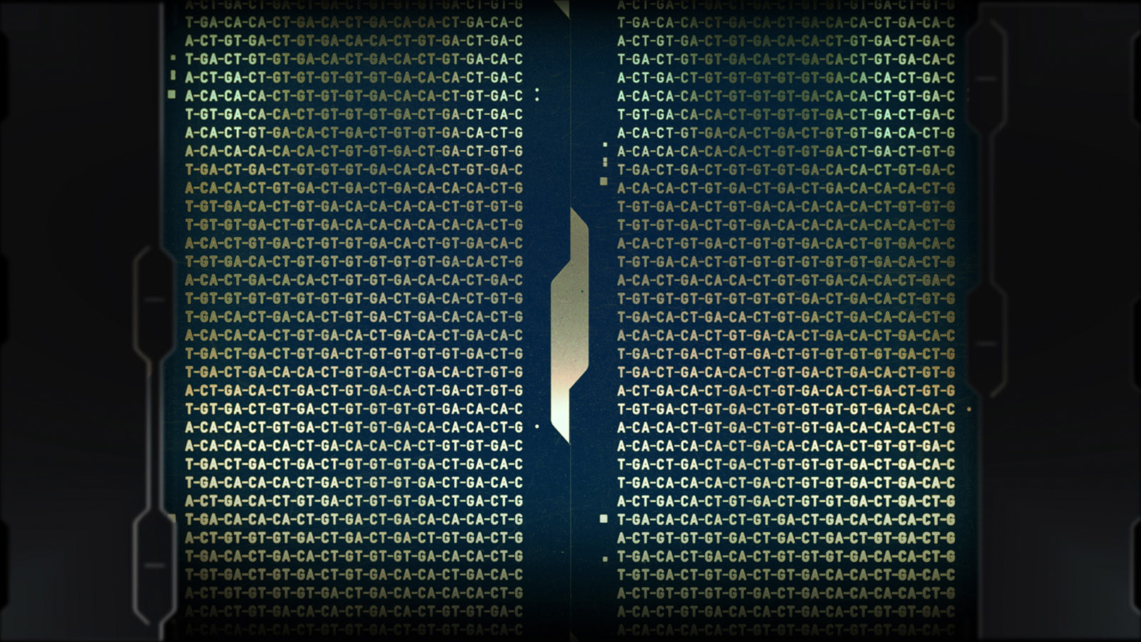
Blade Runner 2049 - UI Design
Today we're looking at the wonderful UI work created for the recent film Blade Runner 2049. Included here is both a UI reel and a concept reel by Territory Studio (Avengers: Age of Ultron, Guardians of the Galaxy, Jupiter Ascending, Agent 47), who we're brought into the project early to define the visual language of all screen based interfaces and systems throughout the film.
The concept reel below is particularly interesting and provides a glimpse into the creative process. It features references, motion tests and an overall look at the experimentation and work involved in getting to the final designs.
The film is set after a technological meltdown or ’blackout, where all digital data was either erased or compromised. This set up a world where advanced technology exists but is available only to a specific set of the population, such as large corporations.
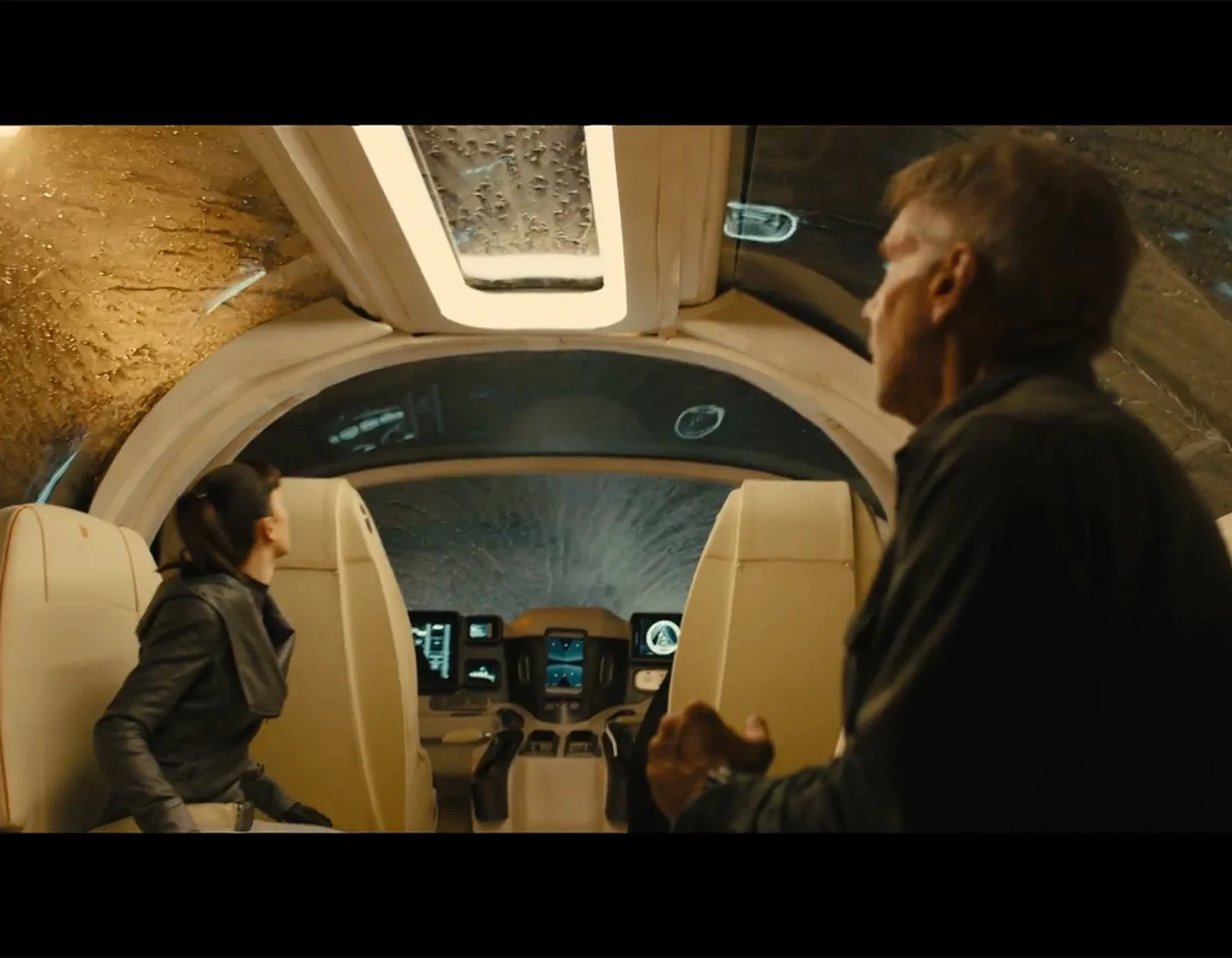
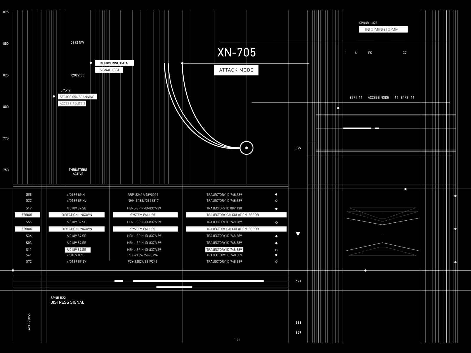
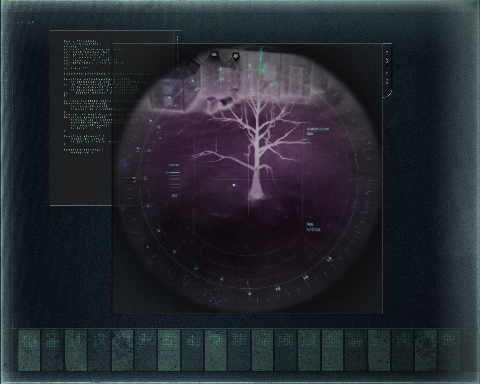
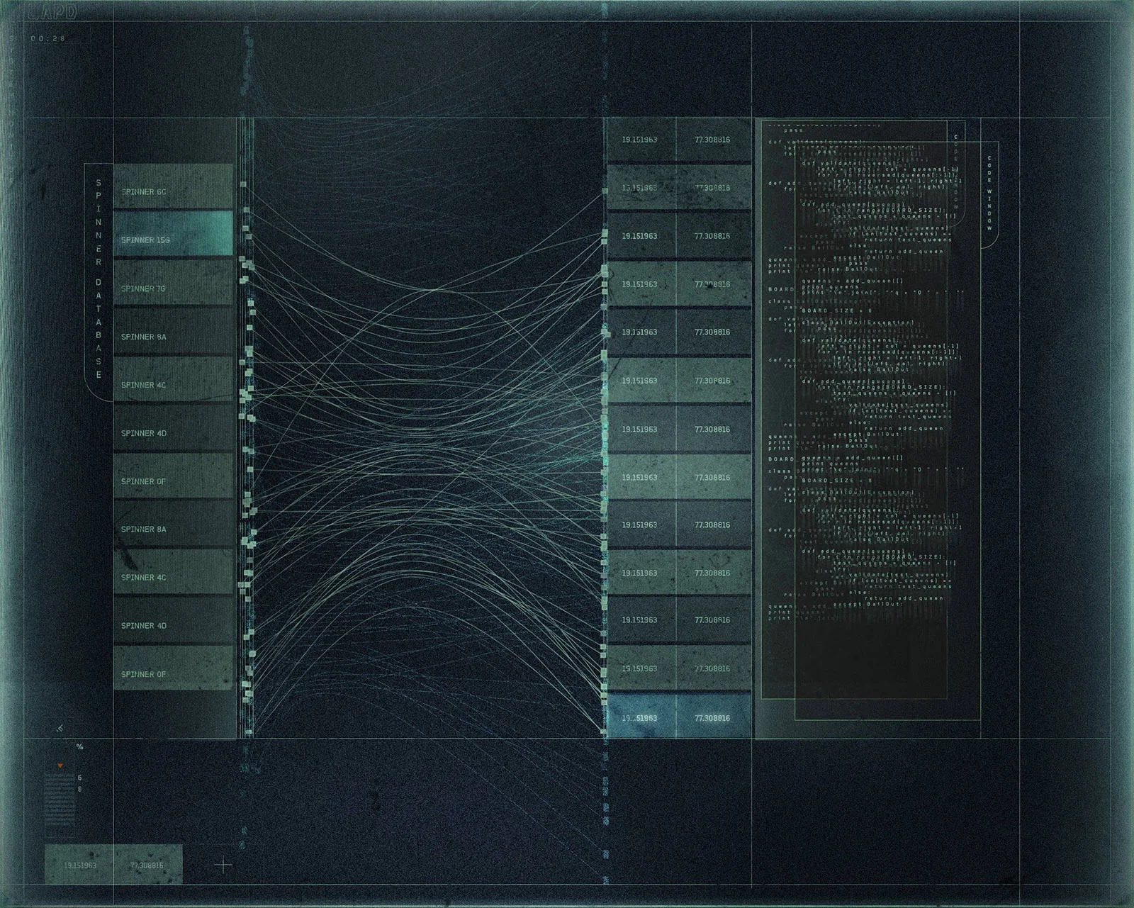
As a result the UI designs can be broken down based on different class structures. Wallace Corporation, the leading technological super power in the film, have the most advanced technology and their UI design is the most elegant and minimalist of the lot. The system used by the LAPD is much less advanced, but still much better than what the general public has access to. They are a bit clunky and gritty in comparison to the Wallace UI. Then there’s K’s spinner, which is dilapidated and barely functional and helps re-enforce K’s low status as a Blade Runner.
This approach to UI design helps provide context to the story and adds depth to the characters.
Many of the screens were shot live on set for the actors to interact with. Most had an initial state, an action state, and a looping state, which was triggered by actors or production staff on cue. Other shots such as the Morgue sequence and the Denabase system needed special attention and lots of tweaking. As a result Cantina Creative were brought in to work with the in-house team at Sony to refine shots in post with direction from Denis Villeneuve (Director).
Here are some images (courtesy of Territory Studio) of the different UI groups.
Wallace Corp
LAPD
K's Spinner
The UI design in Blade Runner 2049 is an amazing piece of work. The team have really nailed the art direction, which compliments the film tremendously. The UI is unique and stylised perfectly for the film and I have particularly enjoyed seeing the grittier, more textured screens. Amazing job!
Tools used:
Photoshop
Illustrator
After Effects
Cinema 4D
ZBrush
More articles on Blade Runner 2049
If you want to read more about the project from it's beginning to end, check out this excellent article 'Designing the technology of ‘Blade Runner 2049’' by Nick Summers (Engadget). It explains how Territory Studio first got involved in the project and the interesting processes involved in creating what you see in the cinemas. A really good read!
Another good read is 'Designing the Retro-Tech Look of the Future in Blade Runner 2049
' by Meleah Maynard (Studio Daily). This article talks about Cantina Creative's involvement and features an interview with Lead Designer Alan Torres and Designer Cisco Torres.


