Halo Wars 2 - FUI Supercut
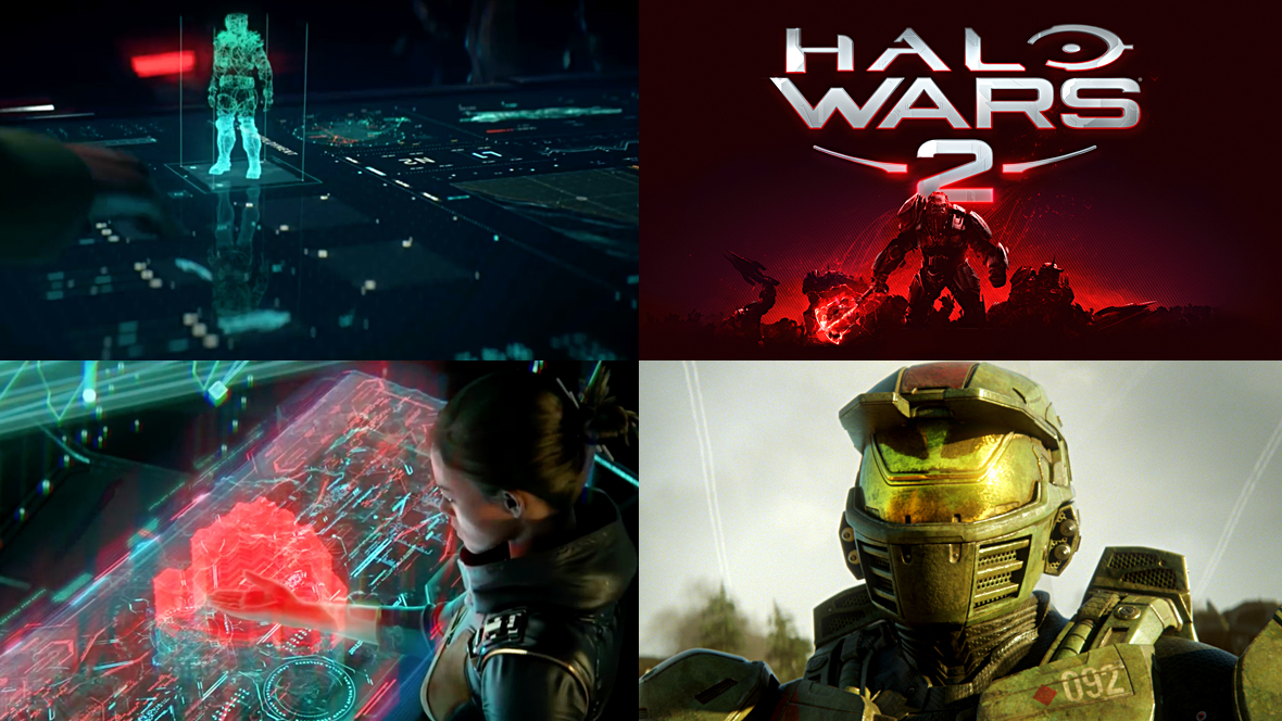
The cinematic cut-scenes from the game Halo Wars 2 features a lot of FUI. Here is a supercut showing only the scenes that feature FUI.
The Halo Wars 2 cutscenes were produced by Blur Studio, known for creating amazing CG and VFX for film and games, in collaboration with GMUNK.
Most of the UI you see revolves around holograms, such as interactive table tops that project interactive 3D holograms, ‘Isabel’ an AI that’s visualised as a holographic avatar and several other screen graphics.
Halo Wars 2 relies heavily on the FUI to help drive long sequences of dialogue between characters and to help explain certain plot points. Not only is the visual design great but also the interaction design. The cut scenes introduce a lot of interesting ideas around how a user can manipulate content.
Grab and Drop action
Being able to move content between different form factors to utilise different control mechanisms is incredibly useful and we will no doubt see more of it in the near future. With Airdrop and screen mirroring so readily available today, along with smart home connectivity and The Internet Of Things, it will soon be the norm. I love how it has been visualised in the example above with an intuitive 'grab and drop' gesture, which reminds me a bit of the screen to screen sharing scene in the first Avengers movie (See clip).
Summoning content
This sequence is particularly nice too where the scientist drags her finger across the screen towards herself, which summons a piece of holographic content towards her console. I like how she takes a step back when this happens, as though she's worried the hologram might hit her. I'd probably do the same to be honest! These little details help make the scene feel more believable, it also makes me think that she hasn't had much experience with this UI before. The way someone uses an interface can reflect the relationship between the UI and the user and provide an opportunity to add nuances and help develop a back story.
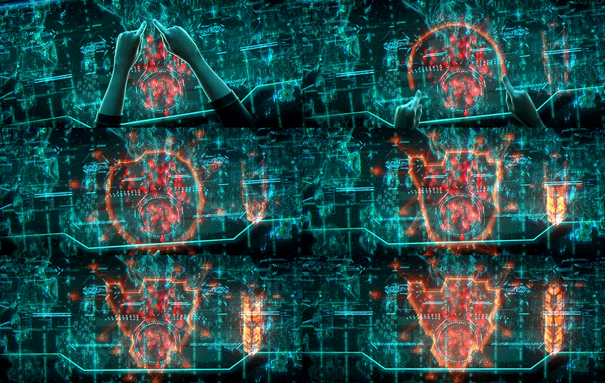
Smart selection
Here's another interesting gestural interface, where the user roughly draws a circle with two fingers and the interface is smart enough to select the specific shape for her. The animation is fantastic, it gives a really clear idea of how the interfaces allows for a margin of error and adjusts accordingly.
These are just a handful of examples from the full video, but there are plenty more. Make sure to check out the rest here!
Image gallery
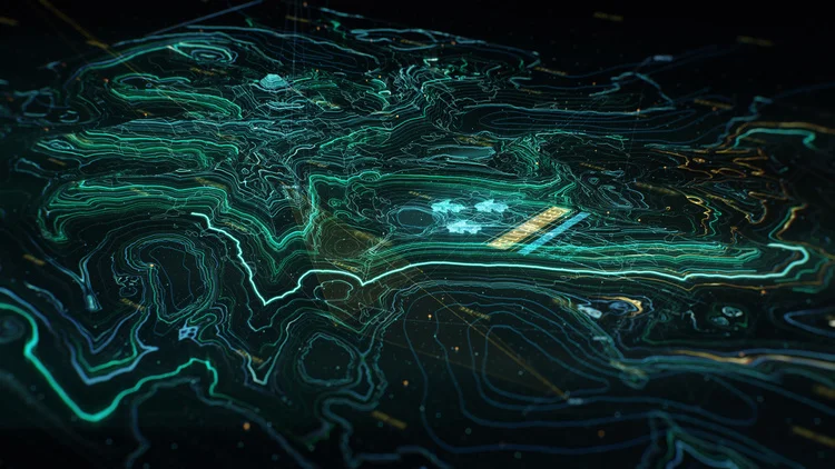
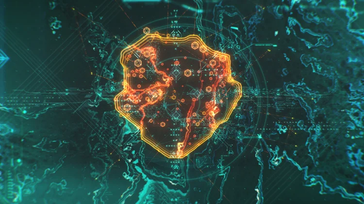
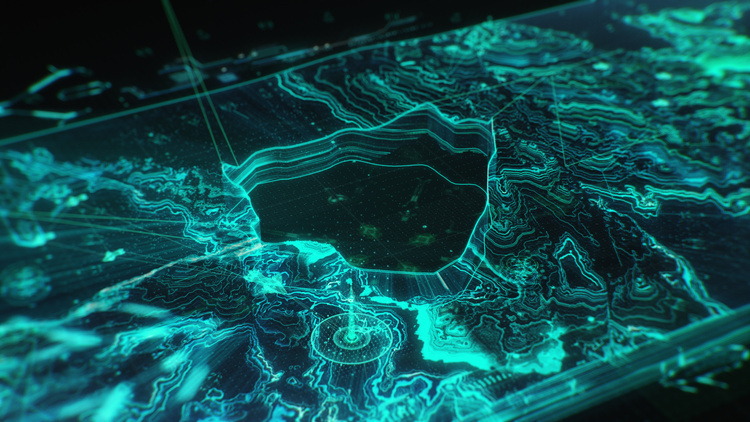
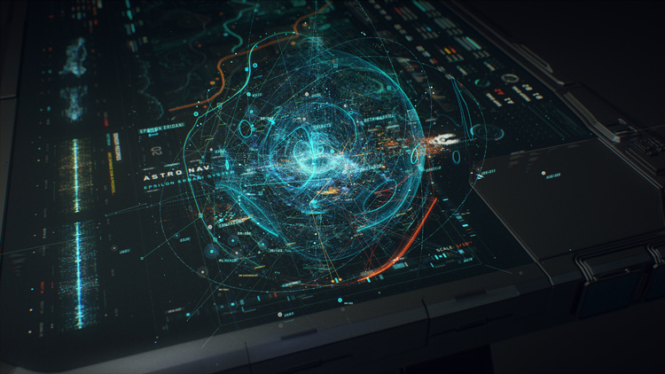
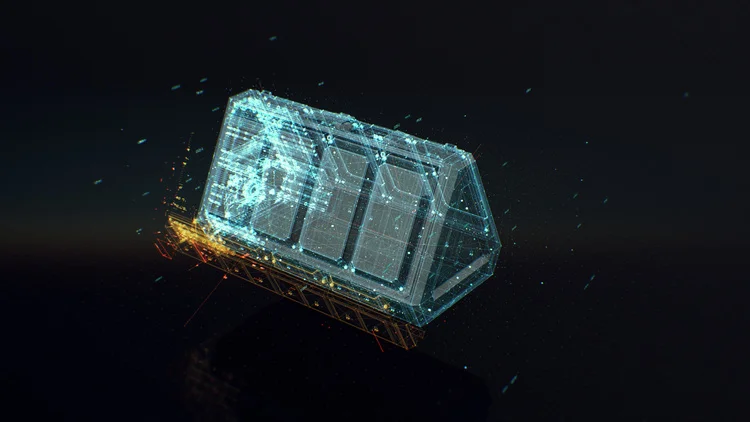
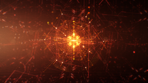
Here are some gorgeous images from GMUNK’s site. Check out his site for a breakdown of the project.
One last thing!
I just wanted to add an extra note to say thanks to everyone who’s taken the time to email, say hi or drop a few coins into the virtual tip jar! It really means a lot and keeps the motivation levels high when trying to balance work, life and deadlines! Thanks from the bottom of my heart! I really appreciate the support!
Extra shout out to Jacqueline Joy over at Massive Damage, the crew at Metabomb design, and Daniela Vallejo!
Jono

