From the future with love - short film
From the Future with Love is a sci-fi short film by K-Michel Parandi that has been floating around the internet for a while now and has been sitting in our backlog. The film is about a future where police departments are run by privatised corporations. The police rely heavily on technological support and as a results we see some interesting examples of HUDs and GUIs.
Here’s a closer look at some of these…
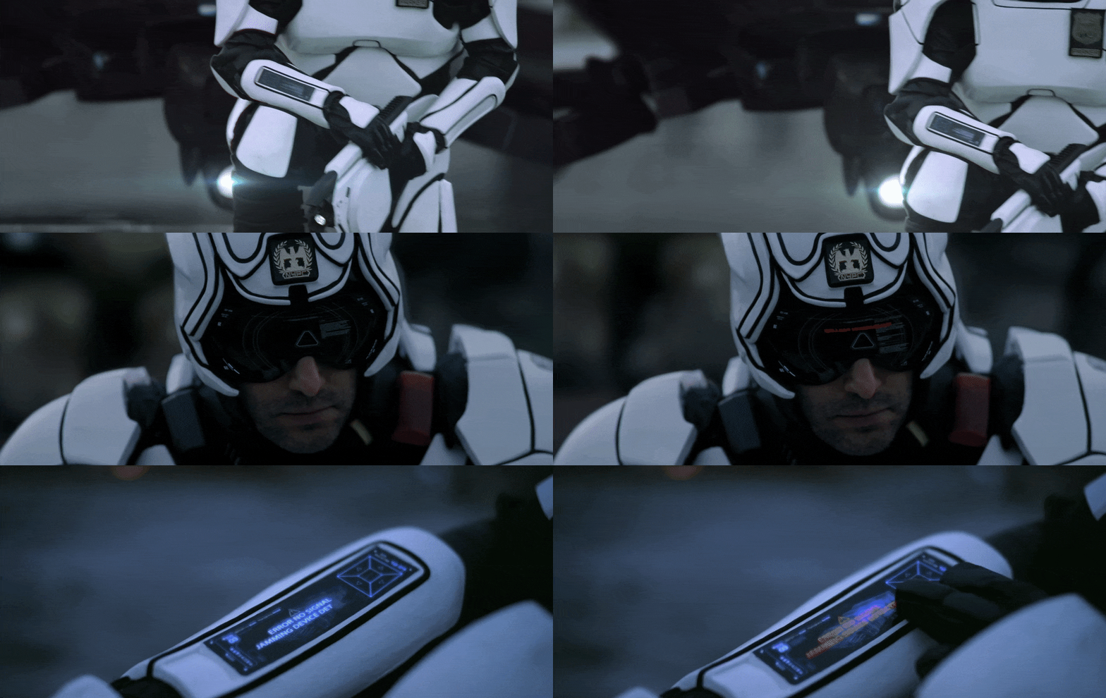
Police Suit UI
The police suits featured in the short were designed by Ben Mauro, and they were the first thing that caught my attention and made me want to watch the film in the first place. I really love the outward facing display on the helmet visors, which looks like they display a lot of processing information. I not sure of the real purpose behind this since the POV of the police officer is completely different, but visually it’s great. It makes the police officers appear seamlessly integrated with technology. I also love the subtle scrolling billboard that appears on the chest plate. Will there be more clothing like this in the future with animated graphics? I don’t know but it’s an interesting concept.
Drone UI
The drone UI is nice and features a lot of real world elements. The arrangement of the layout allows for the key messages to be translated quickly and clearly. I also like when the police officers leave the NYPC area and enter a new jurisdiction, the treatment is simple and believable.
Hacker UI
The hacker’s UI is nicely designed and looks distinctly different to the other interfaces in the film. His goggle’s look like it’s displaying source code or in a debug mode of some kind. The touch screen itself is more of a visual interface but it’s one colour and quite bare-bones and glitchy. It all kind of reflects on the character himself and the type of equipment he chooses to use.
Table UI
This tabletop interface presents some nice ideas and raises some interesting questions. Having object recognition and providing options relating to specific objects like ‘Refill coffee’ or ‘Fill water’ seems like a good use of an interactive table, it’s very practical and improves service much like passenger seat options on airplanes. Being able to pay a bill unassisted is great too, and using fingerprint verification raises some interesting thoughts. At first glance I thought it was quite cool to have the food scraps and crumbs sit over the table UI as it certainly helps build the illusion of realism but it does raise some possible issues. Mainly that the crumbs in some instances covers the content, not a deal breaker, you’d just brush it away right? But does that register the table input? Does it decrease or increase the tip amount unintentionally if the crumb was sitting there? Does that have an overall effect on the waitress’ tips throughout the year? Obviously it’s all hypothetical in this case but these are some external considerations that need to be thought through when creating UI in a practical setting. This is just a great example of how quick prototypes or future vision videos help validate proof of concepts.
Final thoughts
All in all, I’m constantly blown away at what’s possible with lower budget films. Watching this reminded me of some other Sci-Fi short films we’ve covered in the past (Plurality and Archetype)
I can only imagine what we can expect from independent films nowadays considering what is available to designers now and what one person with a laptop is capable of!
Look forward to seeing more and if you guys are directors or come across any independent Sci-Fi films in the future, please share them with us!


