Black Widow
Here’s a look at Marvel’s Black Widow, a spy thriller that features a handful of espionage related FUI and HUDs.
Most of the technology is developed by the same source, the Red Room program (a secret Soviet-Russian training program), and as such there is a consistent design aesthetic throughout all these examples.
Given this, it’s interesting to note that the majority of the UI is written in English. I wonder how the film would have been impacted if it were in Russian?
As you would expect from a Marvel film, the FUI is executed cleanly and does a great job of forwarding the plot.
Taskmaster HUD
Unfortunately for us, there’s only a short glimpse of the Taskmaster’s HUD, but taking a look at these shots close up gives you an idea of the processing that’s occurring.
The anatomy tracking is interesting both visually and functionally as it hints at Taskmaster’s ability to mimic others. From an AI (Artificial Intelligence) and machine learning point of view, this makes a lot of sense.
I really like the scanning animation of the briefcase. There’s a lot of detail in that very short scene. The slight distortion ripple on the briefcase, the shifting tracking markers and the pixelated shading are simple but very effective.
It was nice to see how the HUD looked in daylight for the car chase scene. The weapon selection function on the left looks very game like and subtly emphasises Taskmaster’s mastery over different weapons.
Tablets
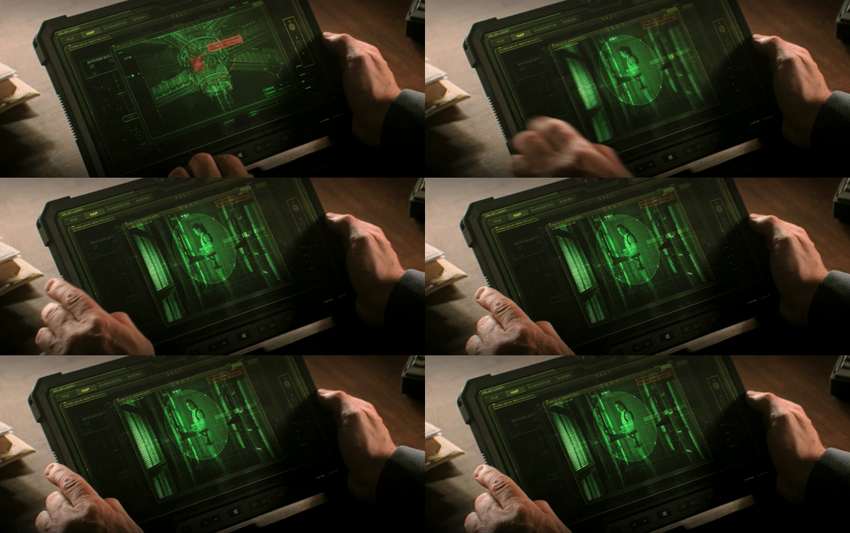
Tablets make up the majority of FUI in Black Widow. The tablets demonstrate basic interactions and bright green text, familiar to this genre of Mission Impossible type spy films. Rachel Weisz’s interactions seem a bit disjointed when scrutinising from up close (not really noticeable in the normal viewing of the film), which is perhaps a result of having to respond to her acting in post production rather than using an interactive screen. The overall look sells the idea of a tactical in-field device used by intelligence services operatives.
Dreykov’s office
Dreykov’s office features a holographic screen projection, which is unlocked using his pinky ring. The projection reminds me of the Splinter Cell Blacklist projection (see Splinter Cell article).
I like this idea that Dreykov’s office computer is unlocked using his personal ring. Being an elusive and highly protected person allows this system to work. I also like the added layer of requiring a specific scanning pattern to unlock. Essentially this means that not only do you have to acquire the ring first but you also need to know the pattern to unlock the system fully, simply stealing the ring is not enough. The scanning sequence itself is also visually attractive, the way the scanning pad reacts to the ring with an illuminated red grid is quite striking. This is possibly my favourite FUI in the film!
Control station
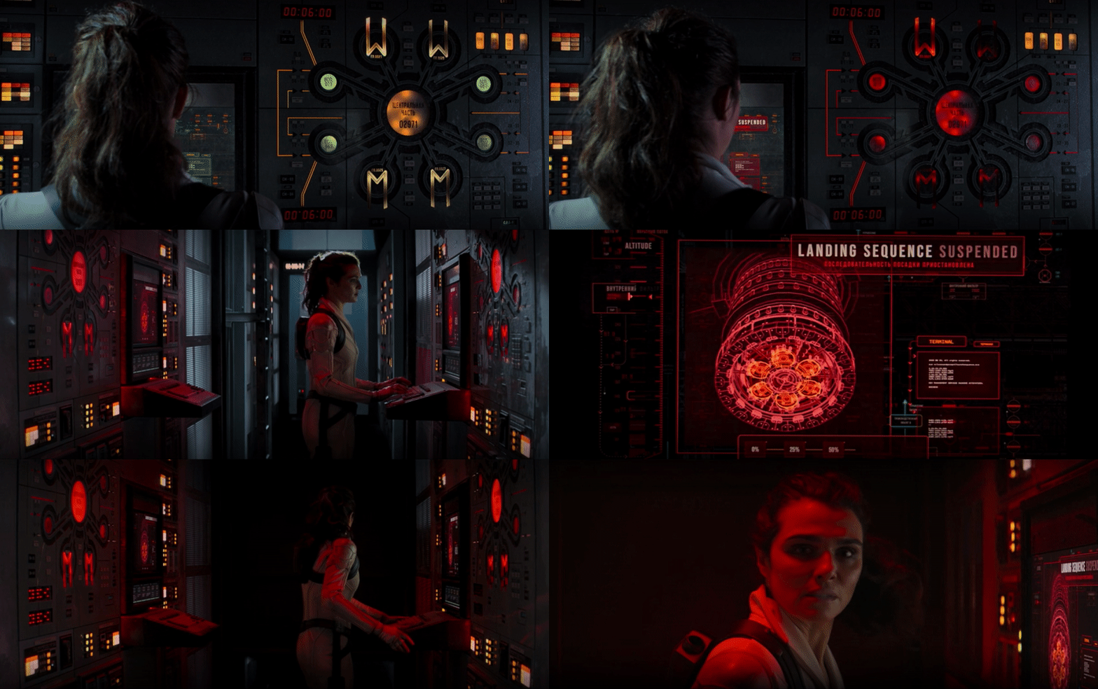
The interface for the control station is really nice and shows a blueprint of nodes, like a diagram of a working system. It’s definitely something you’d expect to see in an engine room or a control system for a power plant or oil rig. What I really like here is the set design of the buttons and the octopus looking panel to the side of the screen. The colours here compliment the environment too, the green, amber and red colour palette give this a Soviet military feel.
Overall, Black Widow provides some great design and animation inspiration for espionage related interfaces. The ideas are quite sound and the execution worked really well for the progression and continuity of film.


