Lightyear FUI
Here’s a look at the various FUI from Disney + Pixar’s Lightyear. There’s a lot of different examples in the film, all of which fits within this overarching feel that blends a toy-like aesthetic with a touch of realism.
Wrist mounted UI
The interfaces used by Buzz Lightyear and the other characters from Earth seem to draw inspiration directly from Buzz's iconic space suit. They all have this moulded plastic look much like a Super Nintendo controller and other similar devices from the early 90s, and helps build this toy aesthetic used throughout the film.
Portable interface
Here’s another device that looks like it was designed in the 90s. Featuring chunky buttons, a fold up display and rounded edges, it almost looks like a kids toy. In fact the UI features a lot of chunky icons and diagrams and could easily be mistaken for a kids game.
Mission Control
All mission control screens use a one colour palette, which helps with focusing the shot. The blueprint of the XL ship is quite nice and gives context to what Buzz Lightyear is doing.
Turnip UI
The UI in the Turnip takes on an amber colour palette, with accents of red for critical messages. This contrasts the background nicely particularly on the screen HUD against the clouds and grey rocks of the planet. It makes you wonder what would happen if they visited a predominantly golden planet? Would that cause major accessibility issues?
Viewfinder
This neat little viewfinder follows the same colour palette as the Turnip spaceship. The shape of the viewfinder is a nice touch.
It reminds me of the scopes from Mandalorian.
Holograms
The examples appear in two very common scenarios; a mission briefing and a video message.
Holograms are great for mission briefings, offering 360-degree views of a scene. This provides participants with enhanced spatial awareness and allows them to view things from different angles. In addition to that, using holograms for mission briefings is great for film, as it allows viewers to see the presentation content whilst also seeing the characters’ facial reactions.
In terms of the video message, we’re not far off having something like that available now.
Spaceship Cockpit UI
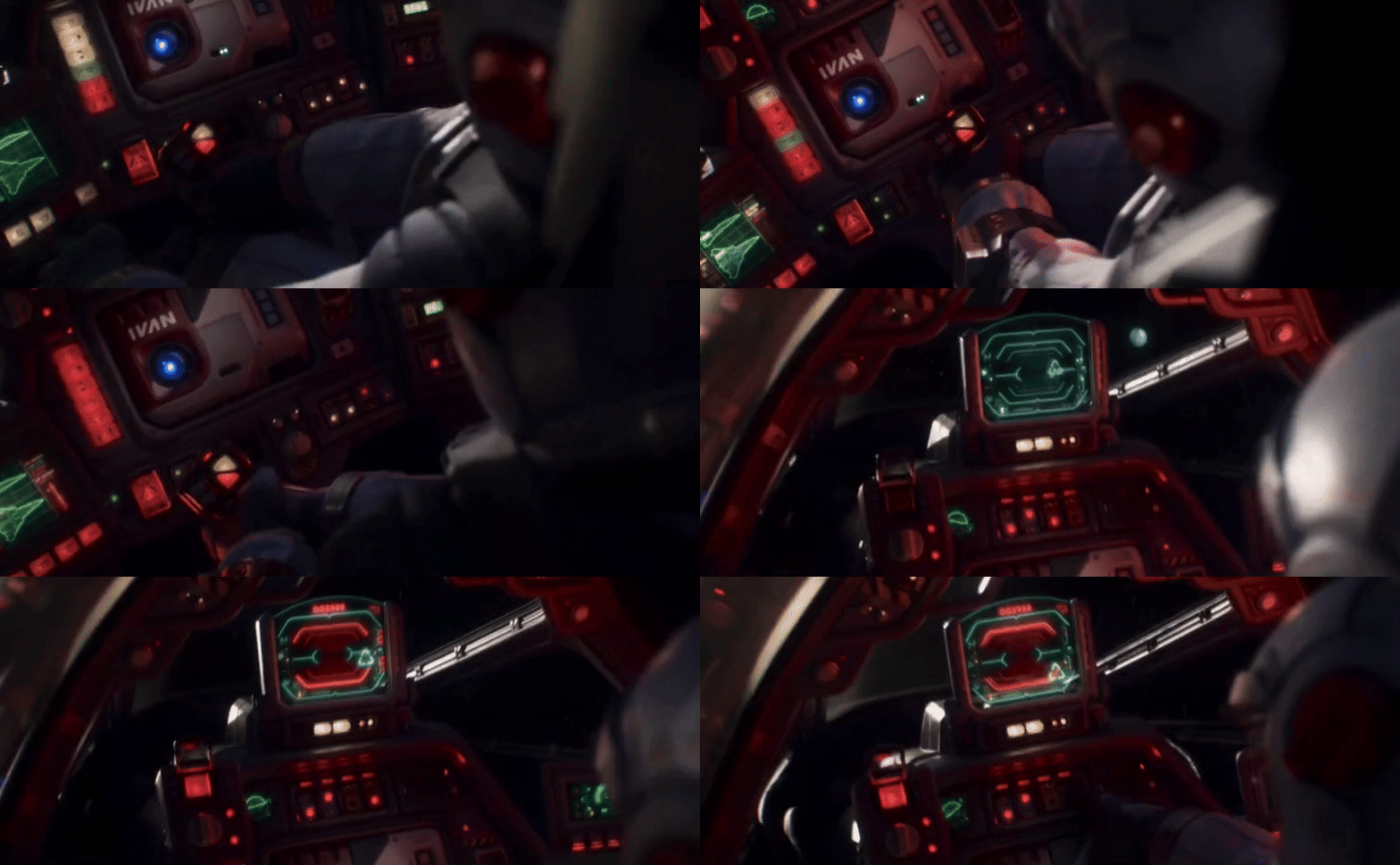
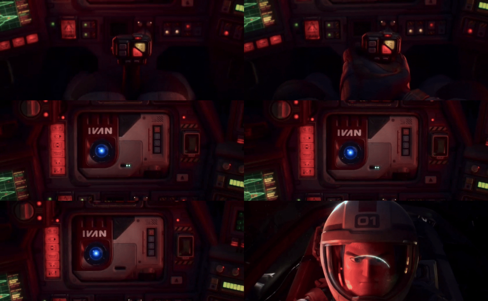
The cockpit in Buzz Lightyear’s spaceship features a lot of buttons and dials, it also includes a HUD and even a holographic display projected from his IVAN device.
The buttons themselves are worth having a look at as they feature a really interesting set of icons.
The HUD is fairly standard but does a great job of communicating story beats.
The holographic display also does a great job of condensing a pretty complicated scenario into a digestible diagram.
Alien Ships
The UI found on the alien ships are drastically different to the human ships, except perhaps for the countdown timer. It’s all about irregular shapes and symbols of varying colours and sizes.
The HUD in the alien cockpit continues this direction nicely. Changing the shapes of the form factor on the main computer and the HUD display also helps build on this visual language of alien tech.


