Silo - Dystopian UI

Here's a look at the UI from the Apple TV series Silo, which takes place in an underground city where the citizens rely on fairly dated technology. Much of the UI work here is reminiscent of old DOS-based systems, but there are also glimpses of more modern and advanced UI.
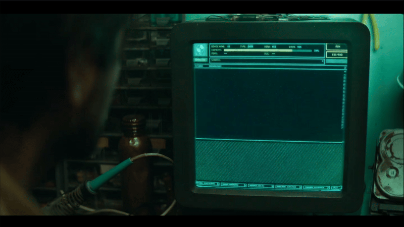
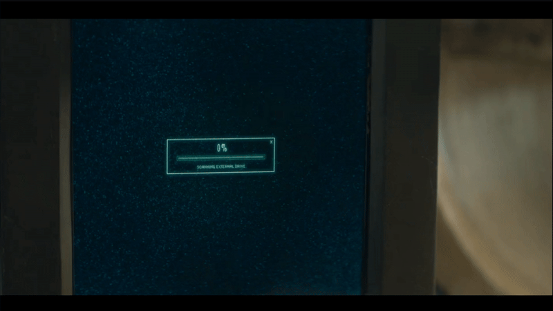
Hard Drive UI
The hard drive retrieved by George features a series of simple text-based menus with a green monochrome palette, accented with subtle yellow hues. Besides the menus, it also features some interesting schematics and maps, showing a mixture of orthographic and 3D diagrams. Having the 3D elements creates an unusual aesthetic, when played on a low resolution CRT monitor. The animations are also thoughtfully designed, taking on a no frills, lo-fi look, that reenforces the utilitarian feel of the Silo’s technology.


Reproductive Clearance UI
Here’s the very formal and sterile UI process for reproduction in the Silo. The depiction of this journey is great, and says so much about the rigid structure of the Silo itself. The layout of the countdown screen is kind of awkward in a good way. It’s able to communicate what it needs to in order to progress the story, but the unusual layout subtly adds to the oddity of this world.


Terminal
The form factor for the terminals is quite nice, especially with the pull out keyboard. The screens feel a little more technical here as it’s meant for specialists and not everyday users. This design really leans into efficiency, cutting out any fluff and putting function front and centre.


Relic Database
Here’s a quick snippet of the relic database that Sims uses. It’s interesting to see that even those in charge and in high positions of power also have to rely on dated technology. It uses a very basic text-based GUI and a fun mixture of type.


Video Screens
The video played from the hard drive is glitchy, washed out and very pixelated. There’s some nice touches in making this video look low quality, like the artefacts and the smearing when George moves his hands too quickly.


Tablet UI
Here’s one of the very few modern interfaces. It’s a voice-activated tablet app that accesses information from an archive. The UI is intentionally unfamiliar, which lets the viewer somewhat empathise with what the character Lukas must be feeling. The layout features thumbnails on the left leading into a spiral of content, which maybe represents the spiral staircase of the silo?
The tablet app gives off a mysterious feel with its gold and black colour palette, accented by glows and subtle lighting. The tablet itself looks like it has a metallic frame, which also adds to the mystique surrounding the device.


AI
Finally, we get a glimpse of the AI, which appears as a hologram projected onto a curved, transparent screen. It builds up the 3D image of Lukas using what looks like a point cloud. Even though it’s monochrome and doesn’t reveal anything too dramatic, it still feels significantly more advanced, especially considering we’ve only seen DOS-like, text-based UIs up until this point.
