Nike iDNation Spot
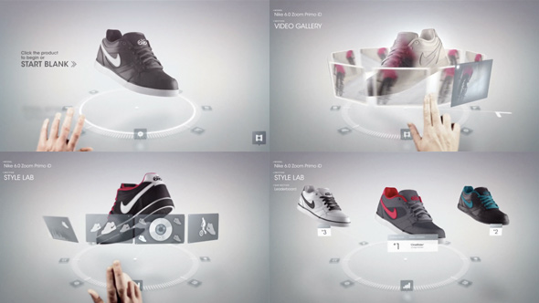
Gridplane and Instrument have created this lovely spot for Nike's iD Nation. The spot is a walkthrough of the process offered on the website, but not a completely accurate one but more of a simplified and embellished version.
The designers on this spot seem to have been given a lot of freedom to elaborate and prettify the interface. The transitions are so fluid and so smooth. There's a lot of great moments in this piece, like when the user chooses a colour palette from the video projected on the shoe, and I especially love the way the carousel opens and retracts.
Visually it's clean, slick and easy to follow. I was really attracted to this type of open 3d lab space, as well as the thin transparent panels with the white silhouette graphics in the 'Style Lab' section. It was quite nice how the panels followed the finger as it hovered over them. It's a technique commonly seen online, but not so much on touch screens. This is because it's usually reliant on 'hover' or 'rollover' states, which became redundant in the shift from mouse & keyboard to touch screen interfaces. However 'hover' states may not be entirely dead yet, and are probably quite achievable since devices like the iphone already make use of proximity sensors (like when the display turns off when the device is near the face during a call). I wonder if they'll follow down this path and how that would affect the way people use touch screen interfaces.
Watch the Nike iDNation clip here or at the official vimeo page