Push 'Strength in Numbers' - Data Visualisation

Directed by Common Good. All compositing & VFX by Common Good
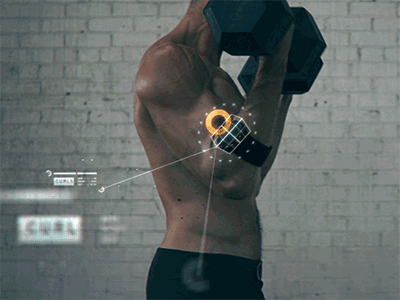
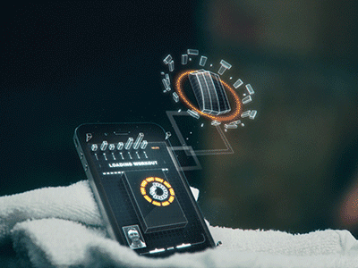
Here's a short trailer by Common Good, for the training app Push. It features a lot of nicely designed data visualisations. The execution is very polished and does a good job of visualising how the app is tracking different types of exercises.
I like the variety of infographics used to describe different types of measurements, whether it be weight, height, speed or power. There are some really nice touches to the style, it's convincingly sporty and not overly techie. The chunky type, grids, and choice of accent colours do a lot of the heavy lifting.
Worth checking out in detail, there's some really cool ideas hidden in there.
Here are some animated gifs lifted from designer Nicolas Girard's site.