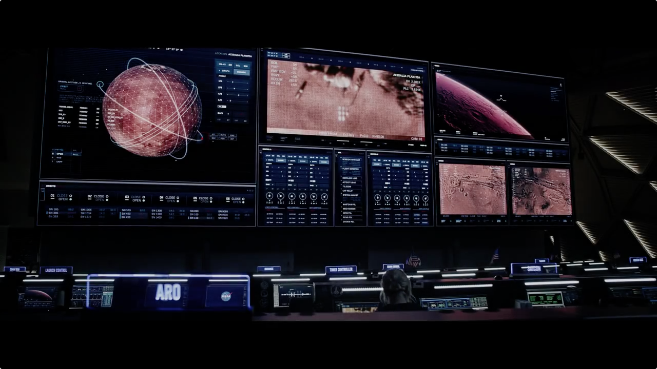
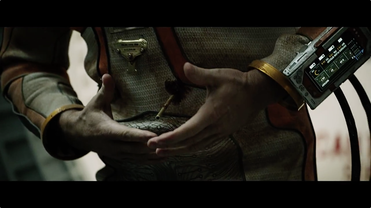
The Martian - UI design

Here are two trailers from the upcoming movie The Martian. They both feature glimpses of the UI design from the film.
The design style is a balance between complex and clean. You would expect screens from NASA to be crammed full of information, telling you as much information about an event as possible. The design touches on this but presents it in a digestible form. The layout structures are neat and adhere to tight grids. The design focuses on clarity and pairs back the flashiness and clutter.
The design is very refined, every element is neatly aligned and padded out. It looks almost mathematical. There's minimal use of icons, but where they are used, they are used well. The icons feel scientific and cleverly designed, they feel like they have purpose and meaning rather than being fantastical and decorative.
The overall design approach feels like a good example of restraint. It relies on typography, layout and minimal uses of colour to do the grunt of the heavy lifting. The use of very small type in some areas helps give the impression of a technical workspace. It highlights of one of the benefits of FUI design, not needing to adhere to minimal legible font sizes and certain accessibility standards. In other words you can get away with a bit more, and use elements like type as a device to communicate overall feel rather than present true content.
This is an example of a very tight execution, hopefully it's an indication of what to expect from the full movie. Really looking forward to it now!