Endless Space 2 - Game UI design
Today we're looking at interface design in games, more specifically for the 4X game genre. I have to confess I'm not much of a 4X gamer but as a designer of UI, I can certainly appreciate the effort involved in designing an interface for such a complex game.
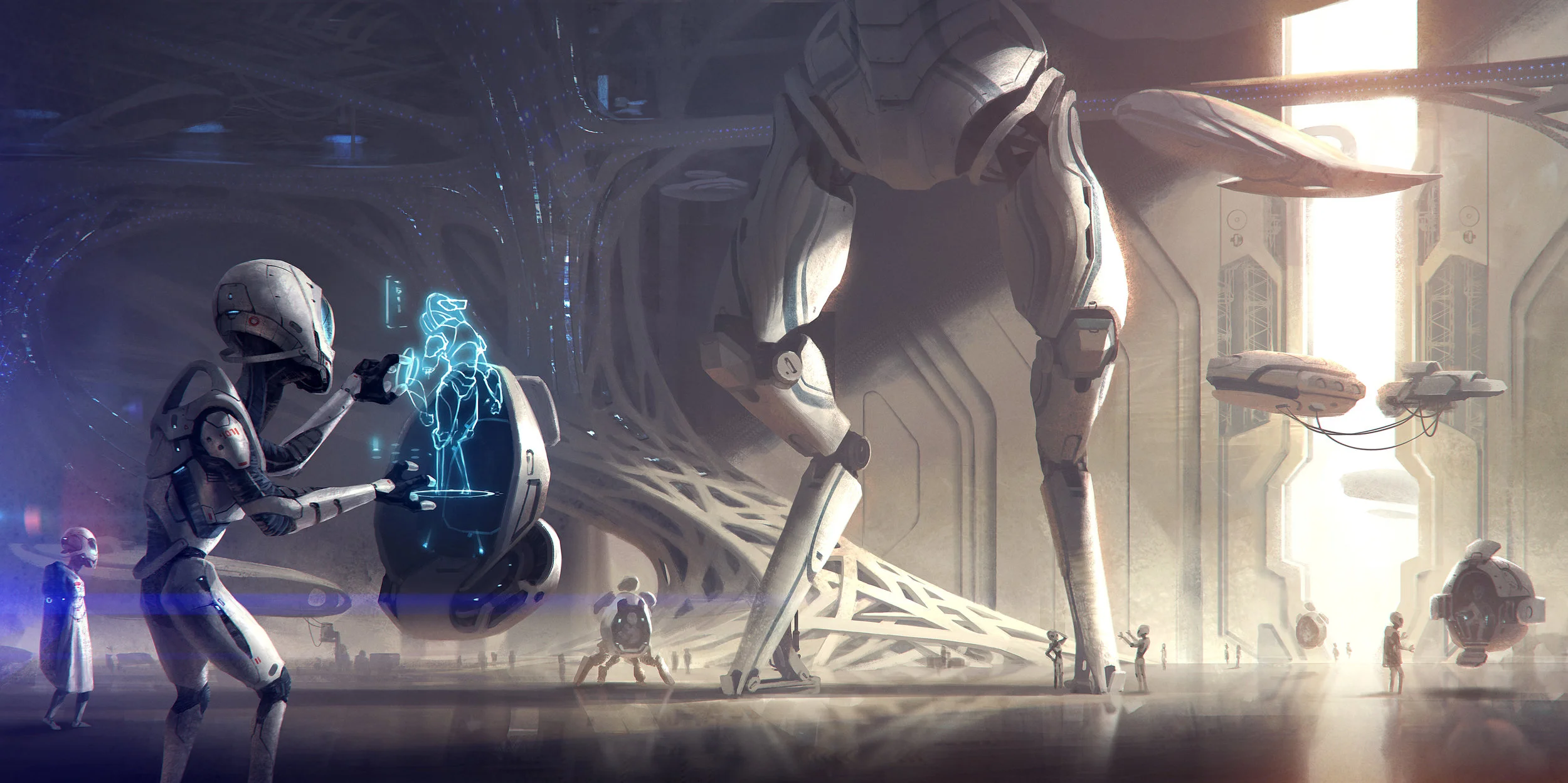
4X is a strategy based genre in both video games and board games whereby players control an empire and 'eXplore, eXpand, eXploit, and eXterminate'. Sid Meier's Civilization is an example of a 4X game.
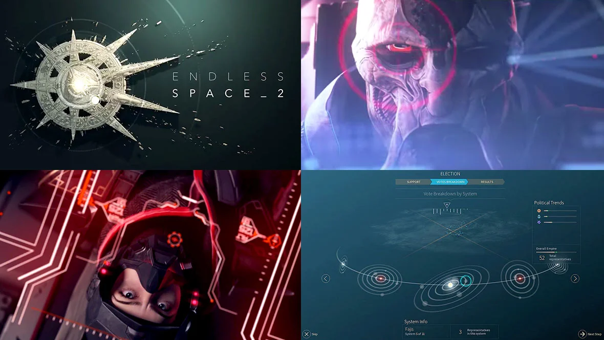
Here we take a look into the design of Endless Space 2. The video above is a review by IGN, which gives a nice summary of the game and quickly introduces some of the different interfaces within Endless Space 2. Below are some more in-depth videos from the game's developer if you prefer to look at each interface more closely.
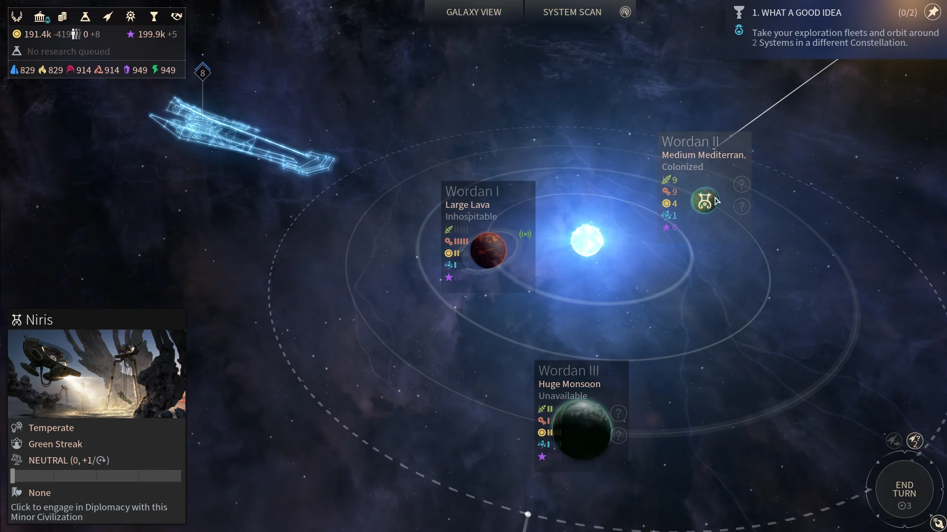
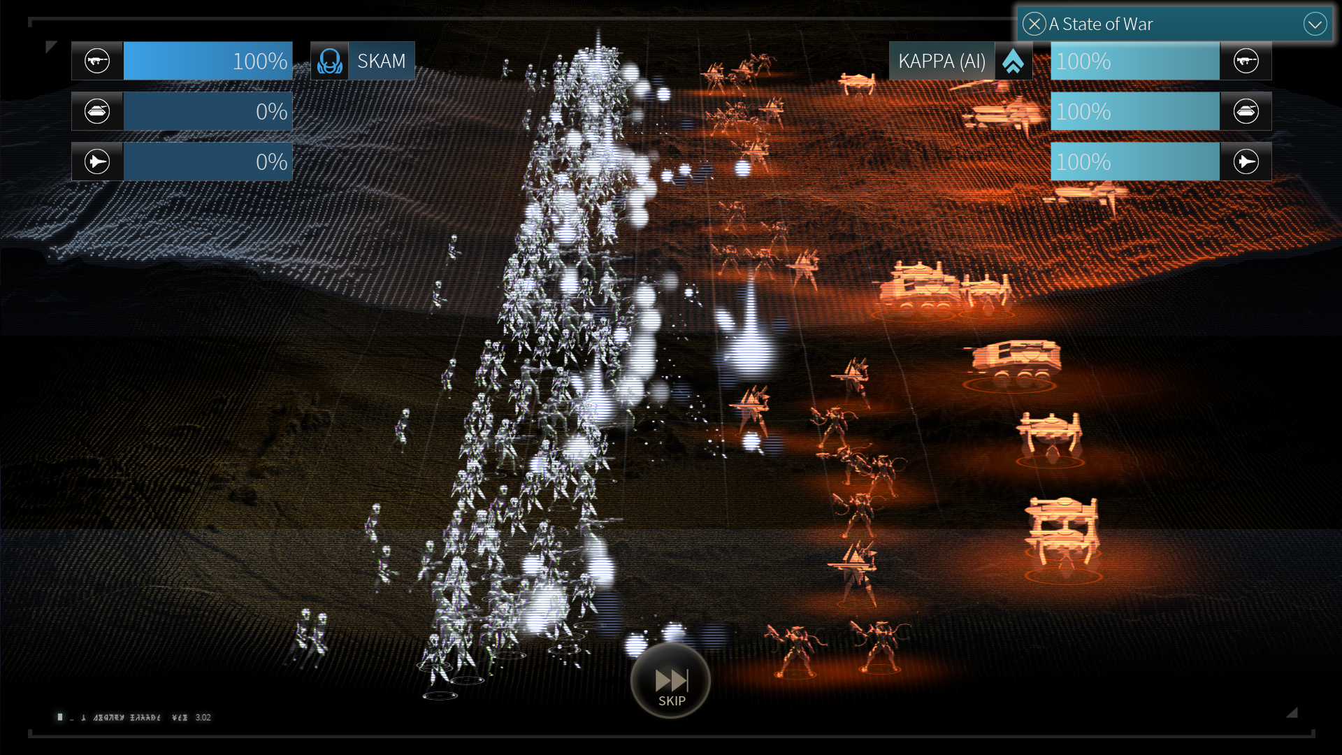
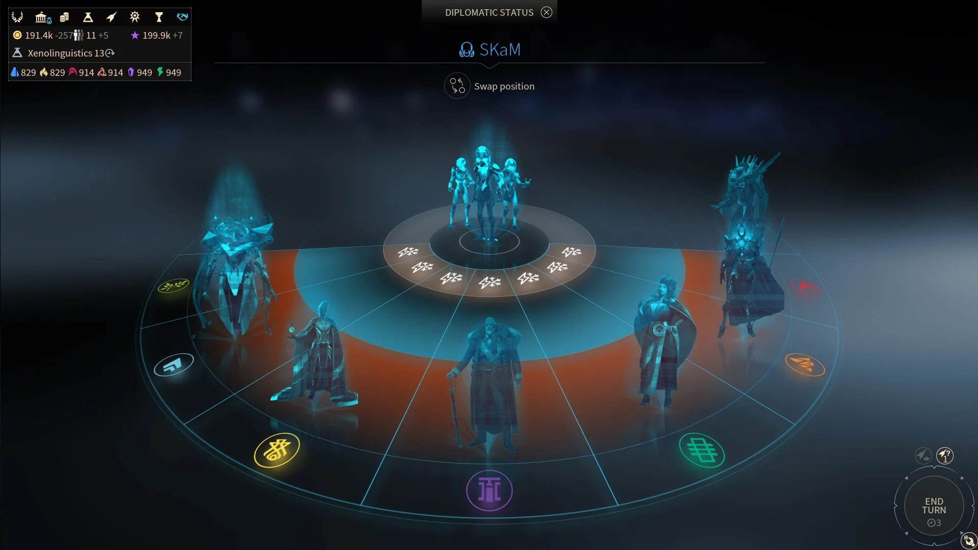
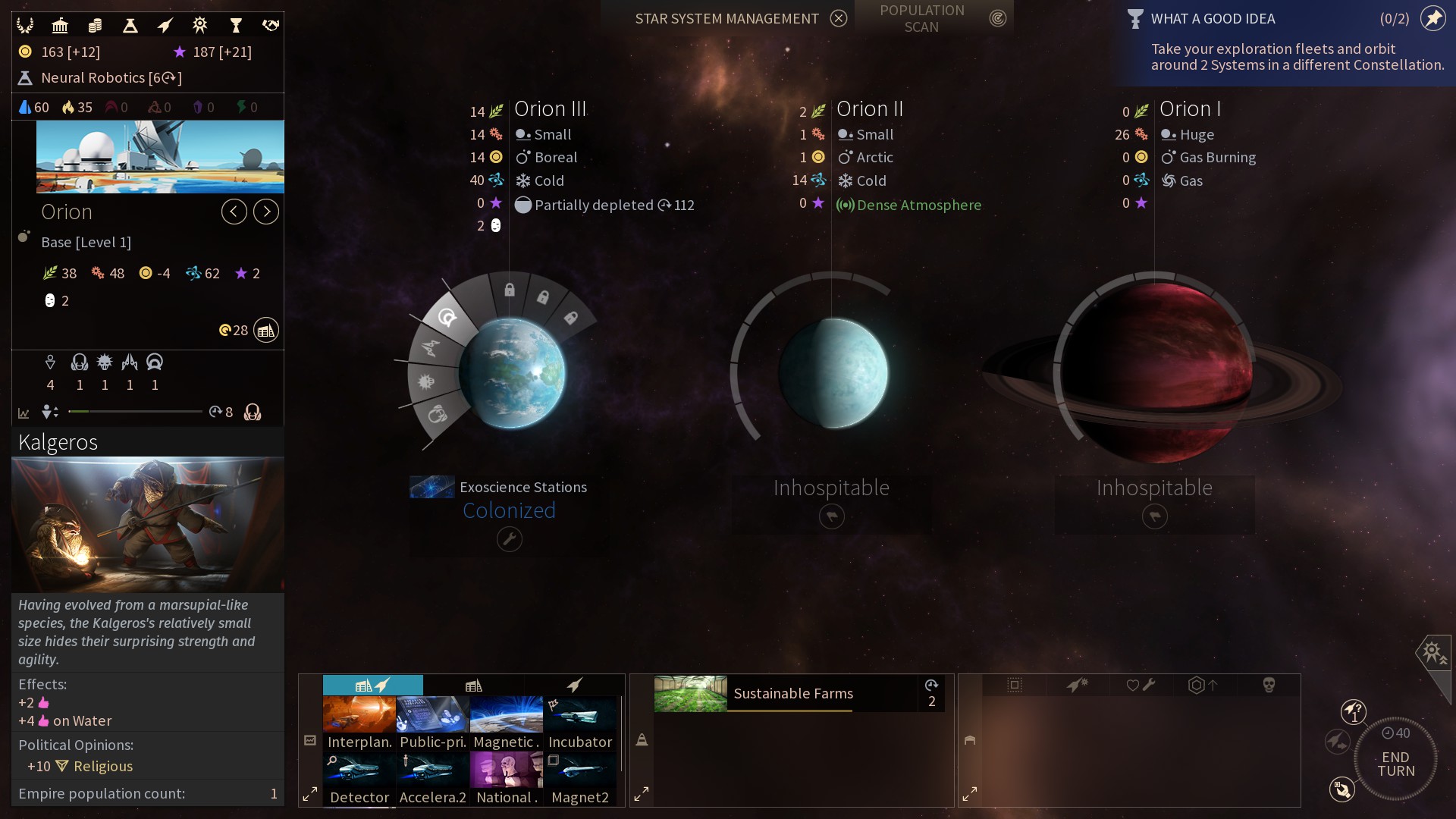
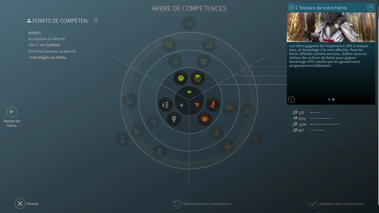
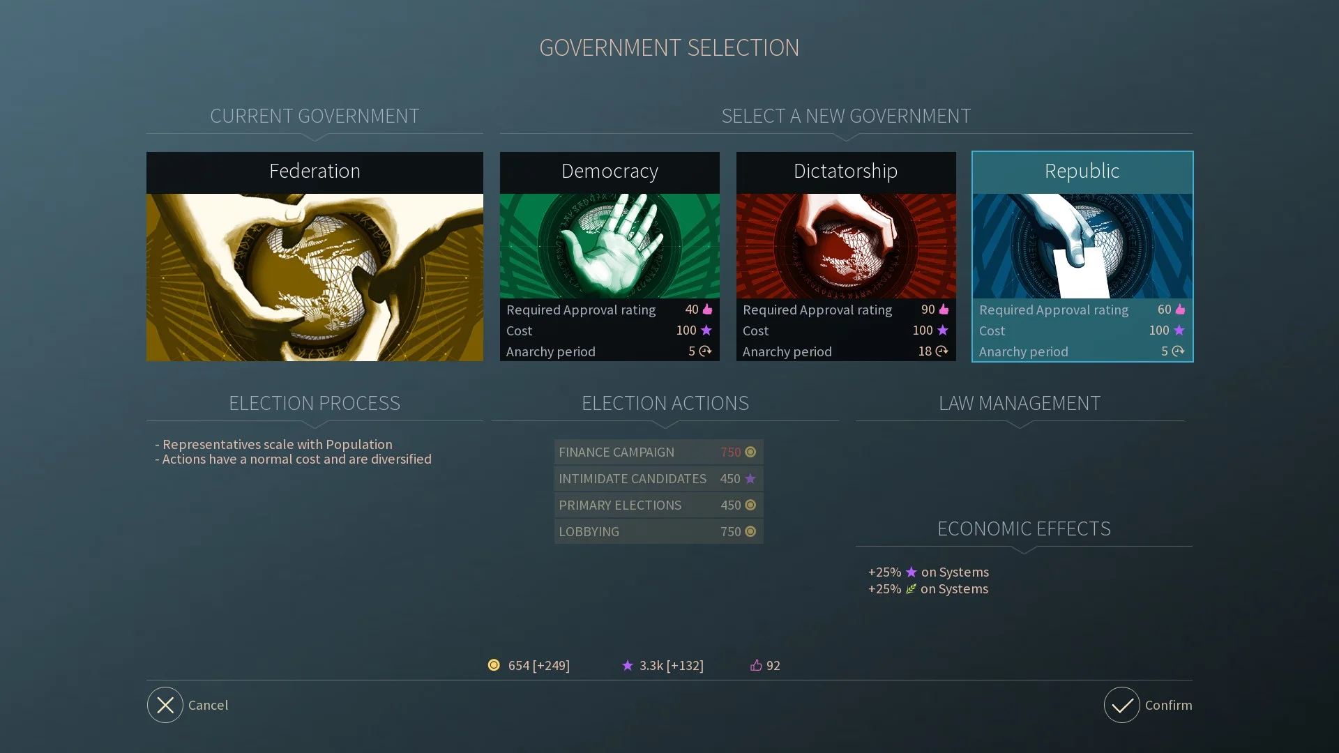
There are many different tasks to complete in this game, from battling, exploring, upgrading to negotiating politics. To facilitate this, the game is made up of a variety of fascinating screen layouts, and interesting widgets.

The design style is nice and paired back, and uses thin clean lines as to allow the layouts to breathe amongst the heavy content. The various layouts explore a mix of shapes and arrangements like hexagons, pie-charts, decision trees, star maps, and strategy plans yet still maintains its consistent throughout.
As a UI designer, there's plenty to explore here. It's so interesting to see how the team approached certain problems with different UI solutions. Kudos to the team for being bold enough to try different things!
How might you have approached the design of such a complex project?
Check it out! I'd Love to hear from anyone who's played the game before and what you think of the UI? Let us know in the comments section.