UI Design in Marvel's 'Avengers - Infinity War '

Here’s a look at Territory Studio’s (Avengers: Age of Ultron, Guardians of the Galaxy) work on Avengers - Infinity War. Territory Studio were tasked with reimagining the UI for Star Lord’s new spaceship as well as updating the Avengers Compound.
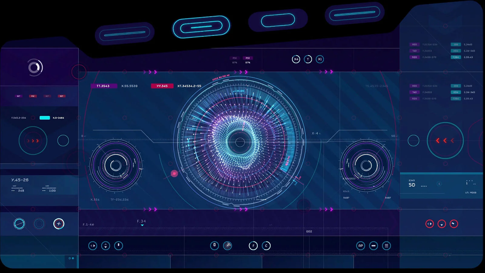
What stands out straight away is the colour palette and the nice balance of contrast to really make the elements pop out. I’m immediately attracted to interfaces that feature interesting and unique colour combinations, and this project definitely has that. The red highlights against the blue and magenta backgrounds for example look absolutely fantastic.
The schematic diagrams work really well in the UI too and they have a really nice shader style. It looks like a combination of glowing wireframes, gradients and x-rays and the colour choices are what makes them look so attractive.


The UI for Avengers - Infinity War is very refined and considered. All the elements seem to be organised in a very structured manner and bound by clear rules, much like designing an operating system (OS). There are a lot of individual details and elements and they all work in harmony with the typography and diagrams. The slight gradients and variations in opacity add depth and subtle complexity to the designs.
The designs for Star Lord’s new ship UI is really fun and interesting to look at and has a lot of character. The odd shaped screens and use of angles really add to the oddity and quirkiness of the ship and is characteristic of the crew itself. The design style makes it feel very personable as opposed to rigid. More suited to a music producer than a rocket scientist for example.


I really think the team nailed it, and have created something quite new and refreshing. Check out the images below for more detail!