Lost in Space FUI

Here's a look at the FUI in the recent Netflix reboot of Lost in Space, designed by Seth Molson and Bruno William.
If you haven't seen the series yet, I'd recommend it. It's a pretty easy watch, and there's just not enough good Sci-Fi series around! Lost in Space is not an overly challenging or confronting show, but I personally found that to be a refreshing break from shows that left me feeling drained and depressed. I enjoyed the show and liked the art direction on the series too.
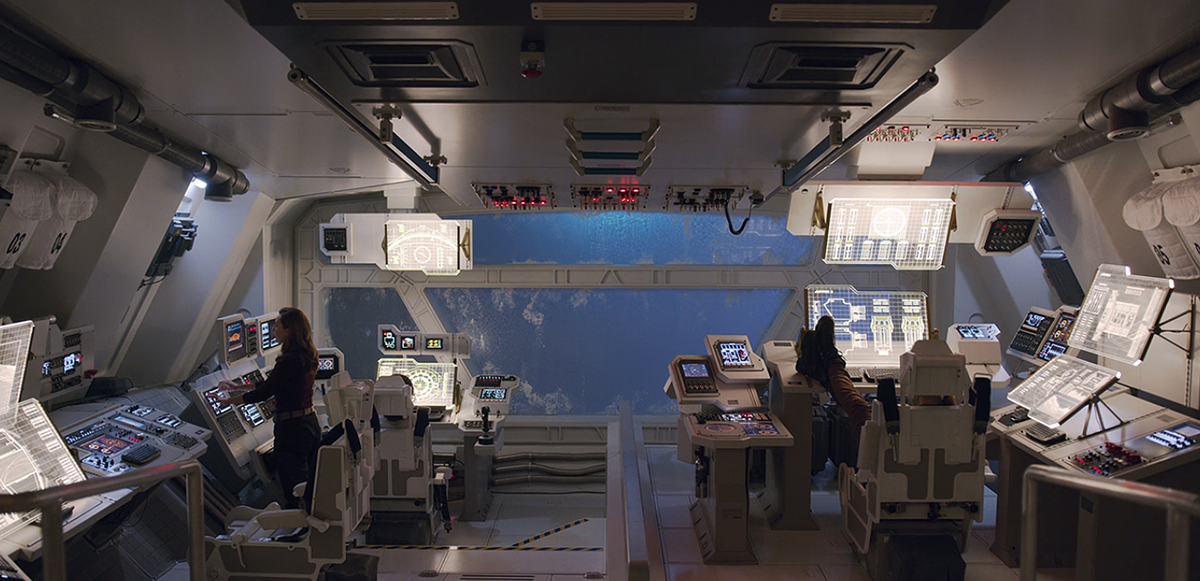
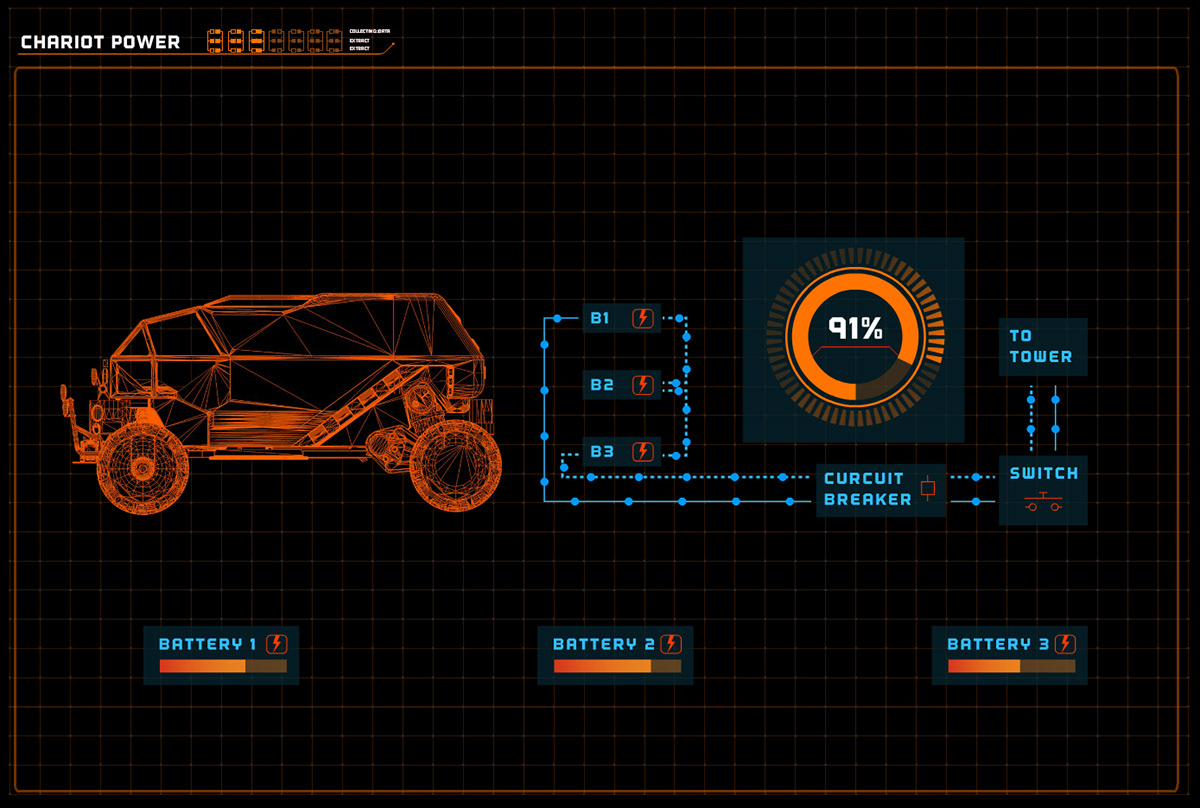
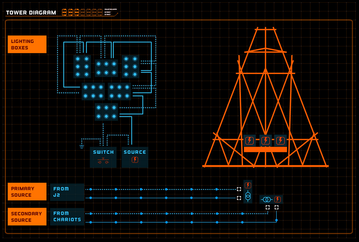
Most of the UI designs are from the human side, namely the Chariots (all terrain vehicles), Jupiters (space shuttles) and the Resolute (Colony ship). However there are two great examples of interface design on the alien side too; the face of the robot and the alien ship UI.
Colony UI
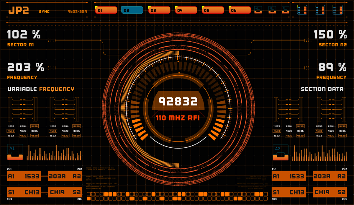
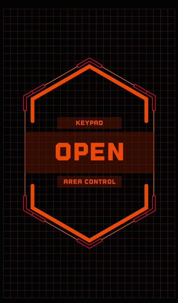
There's a really consistent style to the Colony UI that uses a limited colour palette of mainly orange and pale blue, which reminds me a bit of the Europa Report UI. The UI designs take on a scientific, technical and no frills kind of look. They've chosen to use a chunky typeface which gives the UI a lot of its personality. This 'chunkiness' is continued into the graphs, buttons and icon styles. I like this approach, I think there's a place for it amongst the more minimalist and thin-lined FUI around. This approach gives a distinct look and feel that suits the Lost in Space environment quite well. It's easily digestible and not overly complicated much like the story.


Alien UI
The show's creators did a great job with the way the alien race was presented. They don't tell you too much about them, so you never feel comfortable when they’re around. The ambiguous UI designs help emphasise this.
The alien UI really does feel ‘alien’ and obscure. The UI is not intuitive to human beings. There are some functional cues but not enough to understand how it actually works. For example the robot’s face changes between blue ‘friendly mode’ and red ‘hostile mode’, but other than that we don’t know anything else. Several of the characters try to analyse its galaxy-like pattern but they can’t seem to figure it out.
The alien ship UI is similar. Maureen is able to interact with it intuitively to a certain degree, but has no real understanding of the consequences behind her actions. We see her using sweeping hand gestures to navigate through a Google Earth type display of space, but what if it wasn’t just ’Google Space’? What if it was a navigation system for the ship? Her curiosity could have sent her and her husband halfway across the galaxy leaving all of their children behind. Maybe that’s what she was hoping for? :)
The alien UI shows you just enough to get an idea of what the interfaces do and nothing more. That's what I like about it. It was the first time in a while where I felt a genuine intrigue about an alien race on screen and the alien UI design certainly helped with that.
Check it out for yourself!