Passengers

Here’s a look at the FUI from Passengers by the crew at MPC London.
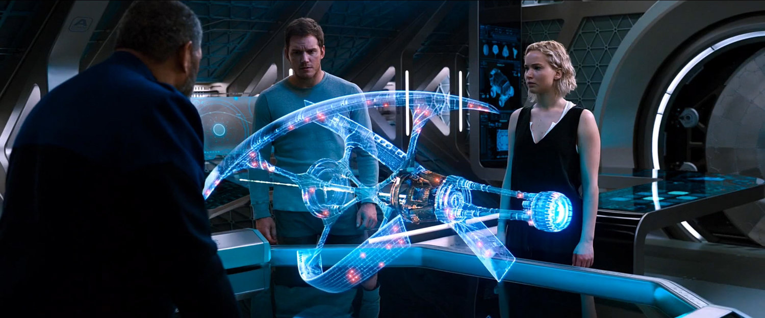
The film takes place on a large space ship that’s transporting colonists to the planet Homestead II. The ship features various interfaces to serve the crew and the colonists with varying levels of complexity.
The design of the UI is not so far off what we expect to see today, but more playfully arranged and with less structured layouts. The form factor of the various interactive displays and devices does a lot in the way of making the UI feel futuristic.
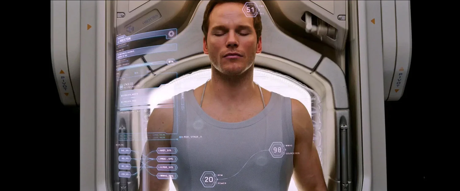
The hibernation pod UI has to be my favourite. I love the muted colour palette and how the UI curves along the unnaturally clear curved screen. The UI is surprisingly clear given how transparent the screen is and I love how the UI itself is what gives the screen it’s shape. The UI complements the shot so well, it’s absolutely fantastic.
Another interesting one to pay attention to are the information stations that display a series of icons on a rotating sphere. The visualisation and concept of this UI is quite unique. The way the interface moves around to face the user gives it an impression of a living AI. I like how the icons move forward in position when selected and how the icons fade towards the back. The UI feels quite plausible and the fading icons at the back of the sphere gives the impression that there could be an infinite amount of icons and possible options. It’s very attractive interface and much more interesting that a flat screen.
There’s plenty to look at, so make sure to check out the video!
For more check out Ryan Jefferson Hays’ Behance page and Chris Kieffer’s site.
*UPDATE - “Chris and his team did all the onset graphics and MPC executed all the post graphics” @jeffersonuk