Grey Goo - Sci-Fi interfaces
Grey Goo is a Sci-Fi strategy game, which features three different factions: Humans, the Beta and the Goo. As far as I can tell, most of the technology showcased is from the Humans and the Beta (the orc-like guys). Axis Animation is the studio behind these clips and the UI reel and concept images are by Martin Aggerholm, who was tasked to build, animate and design the UI. I was lucky to chat with Martin briefly about his involvement in the project, and he was able to share some nice insights into the development of the UI.
Background
Martin was given the concept art to set the initial direction and built out everything from there. From that he was able to see what goes where and which shots were important in driving the story forward.
The camera for all the scenes were locked off by the time Martin got involved. As such the differentiation of focal points and background elements was pre-established.
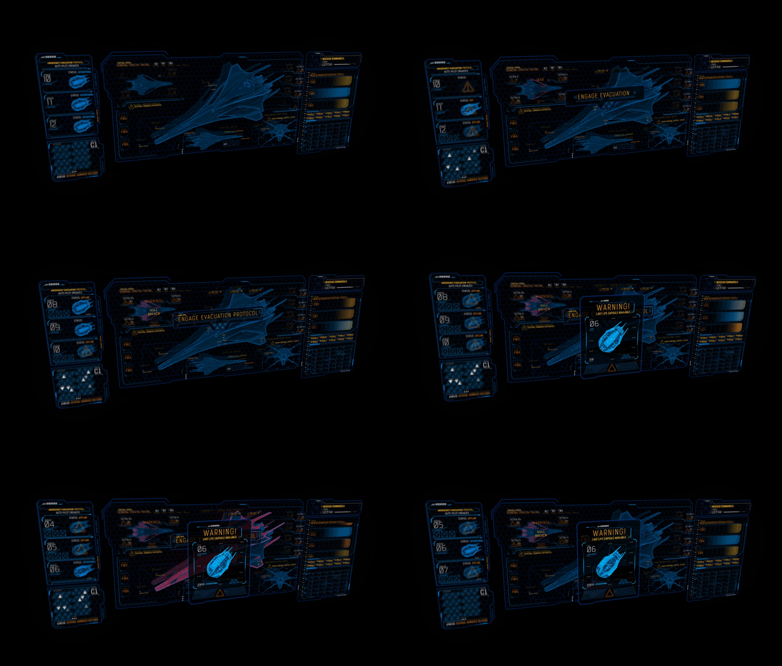
The Humans: UI
According to Martin, this required the most work as it was the vehicle for most of the story-telling. He mentioned that the direction of the style benefited from Director, Dana Dorian and Concept Artist, Jon Beeston's input particularly since there were a step removed from the UI design world.
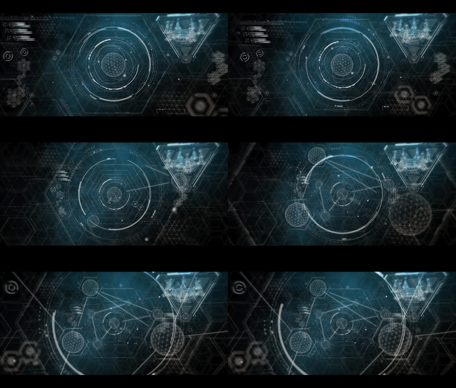
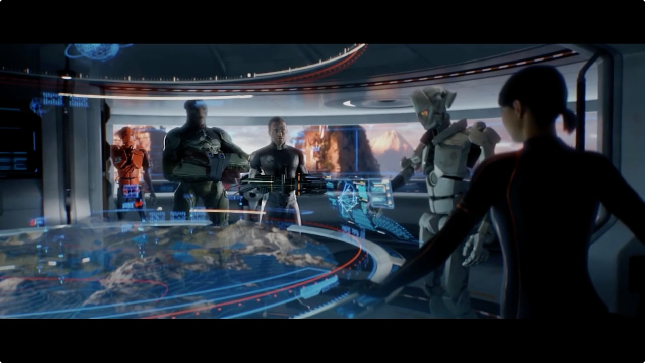
The interfaces from the human faction are predominantly holograms. The main one featured is the holographic map that's set on top of a round table. I love the graphical elements that's wrapped around the rim near the top of the map, it helps frame the interface and makes it feel like the UI is housed within a large cylinder. It's nice that the elements are floating without a base grid, it creates a very spacious and clean display and because they are anchored to the cylindrical surface it's kept neat.
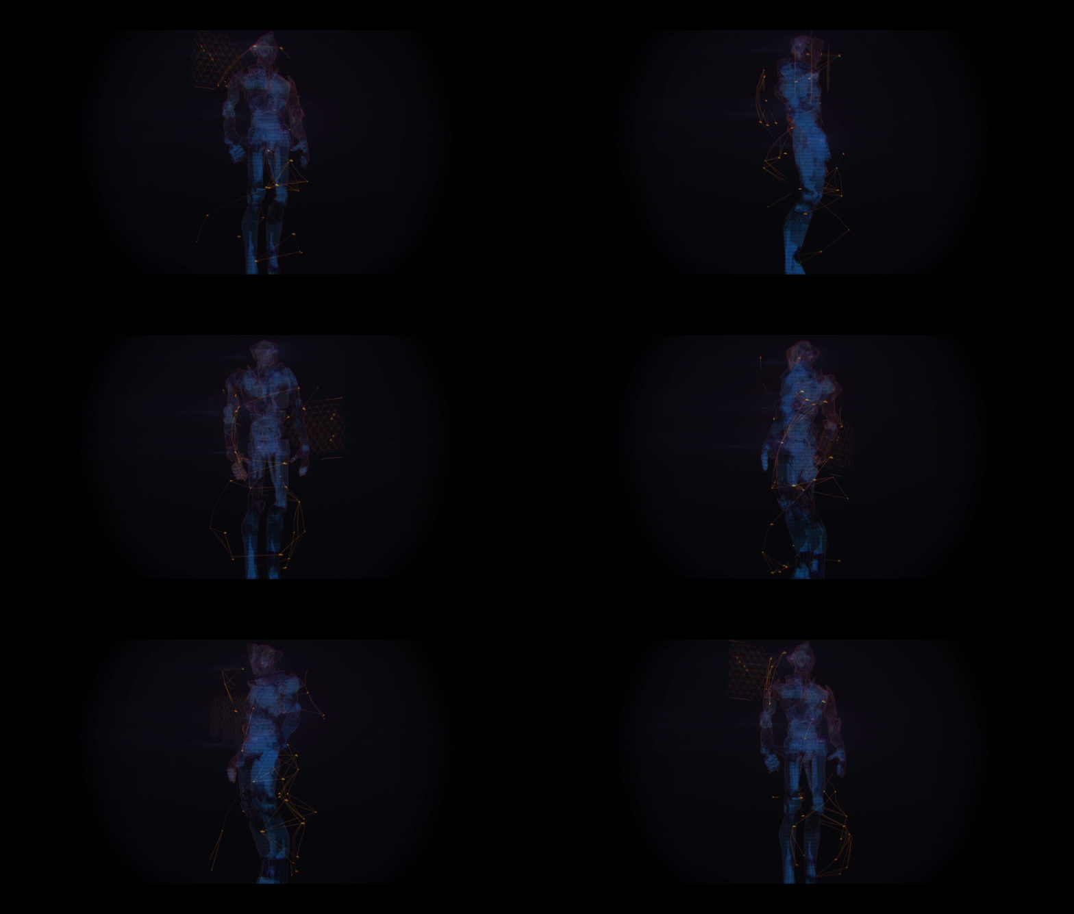
The other interface to note is the controls to the large robot from the Launch Trailer. Again they are holograms but they are controlled by a standing user via two circular interfaces. This reminds me a lot of the Pacific Rim UI, but it's a lot less complex. Instead the design continues with the clean, glassy look characteristic of the human's UI.
The colour palette used in the human's UI is primarily blue, green and yellow and is a lot more colourful than the Beta's UI.
The Beta: UI
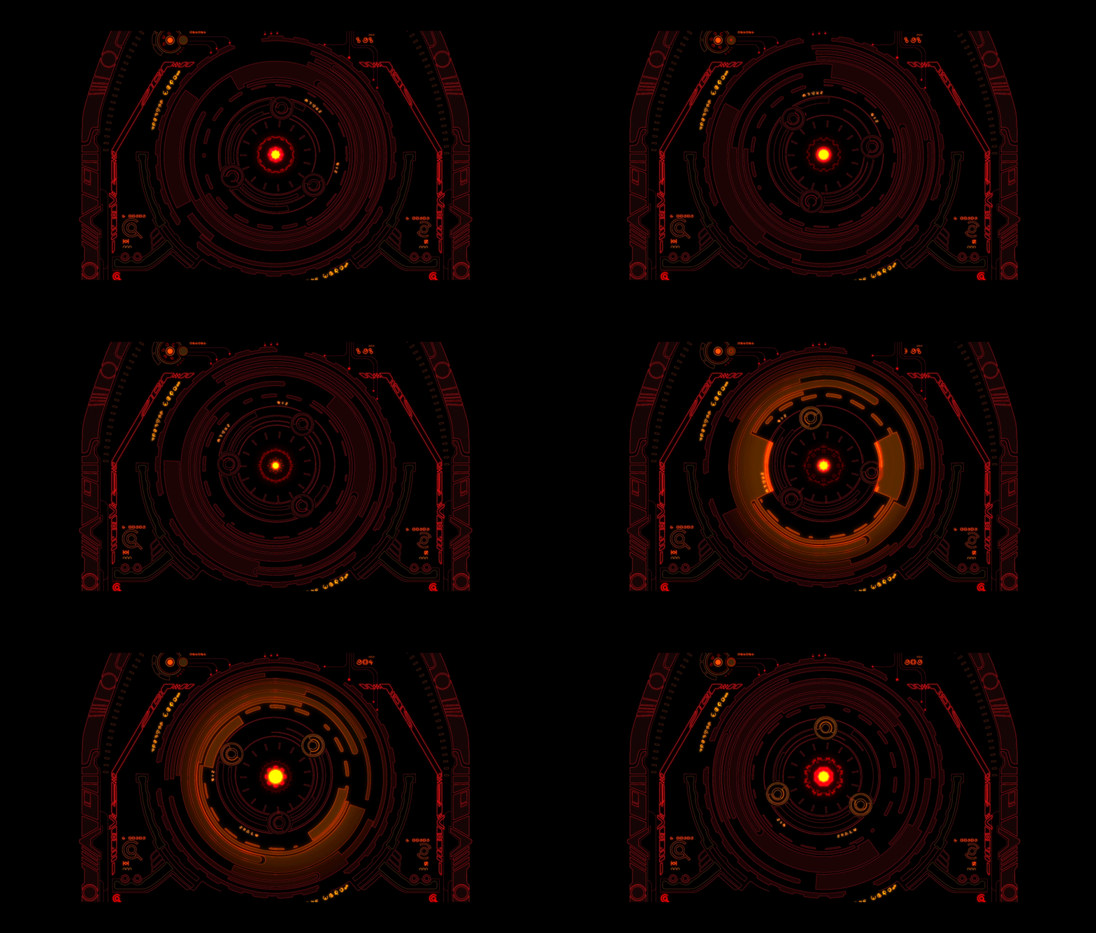
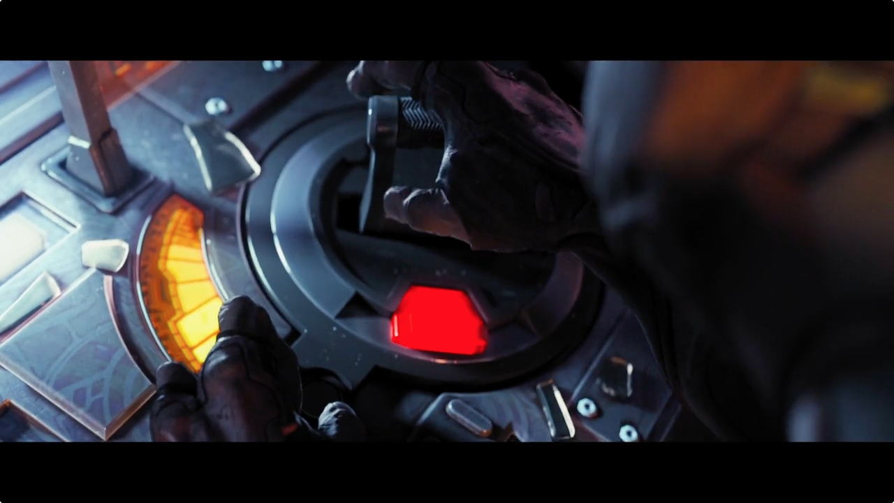
The alien interfaces from the Beta race are noticeably different. I love this exploration of alien UI, particularly when you see them interact with the interfaces.
From the outset, Martin didn't want a simple changeover in typography, instead he re-approached the design through the line-work and the use of shapes. Taking cues from the initial concept art from Weta, particularly the bulky tattoos, which helped shaped the whole visual identity.
The alien interfaces may not make sense to us but it feels like it makes sense to the user. Even though the symbols and shapes have no meaning to us they do appear to be communicating a message visually though the animation and sequencing. I really love this, just as we would design interfaces to be intuitive to a user, the team have created intuitive interfaces for an entirely imagined alien user. It's an interesting challenge given that the users have three fingers and four arms
It's interesting that, regardless of language there are certain visual cues that carry though. For instance, it's clear to see that some motions automatically indicate a warning. It's interesting to explore the possibility of interfaces being so intuitive that it doesn't need to be translated into different languages, and uses animation and colour to bridge this gap.
Grey Goo - All Cutscenes
Grey Goo - Launch Trailer
Image gallery
The UI design in Grey Goo is really special. Make sure you check it out!
Thank you again to Martin Aggerholm for sharing his insights on the project :)
Here's some useful links:
Grey Goo Interface breakdown on Martin's site
Grey Goo Launch Trailer
All cut-scenes compiled into one video
Axis Animation's site


