Retro UI - Decrypt by Peter Clark
Here is the short film 'Decrypt' by Peter Clark, created as part of the Adobe Mentorship Project. It's an experimental film about the possible afterlife of technology.
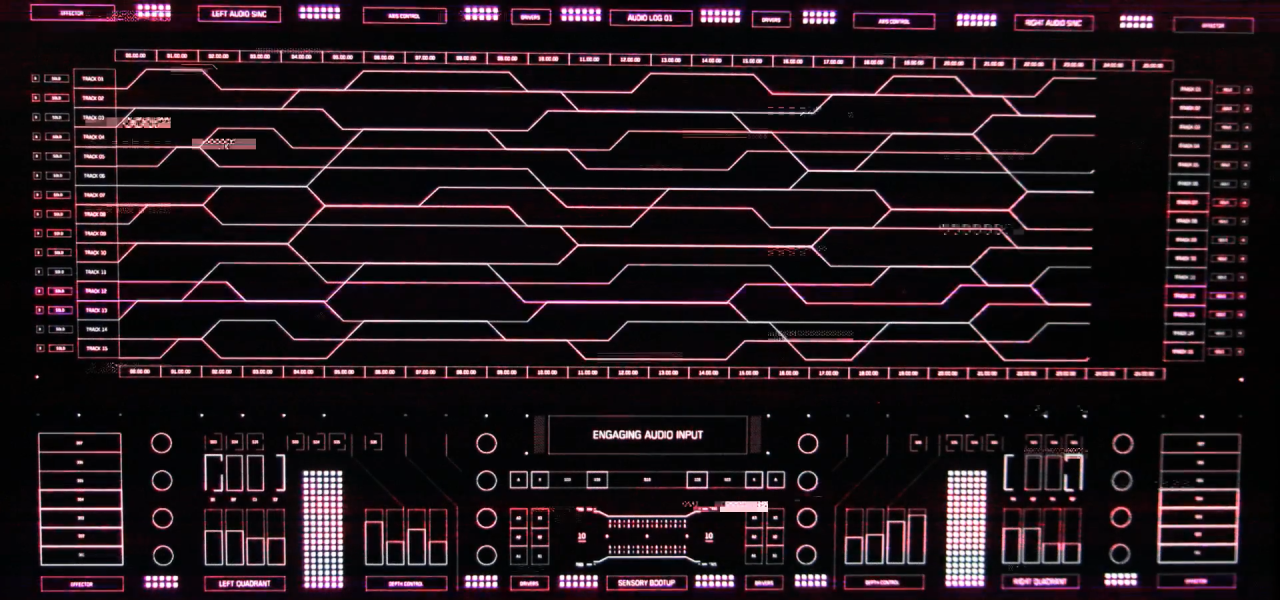
The film features some really beautiful retro looking UI and it doesn't rely on typography to do this. Instead you get this from the choice of linework and shapes as well as the post effects and animation style. The 'two hands' screen for example uses primitive lines and shapes to depict the hands, whereas nowadays you can be so much more detailed. Little touches like that can help build the illusion. Basically it helps emphasise the technical and graphical restraints or the past.
The bootup sequences for each of the shots show how this retro look can be accentuated through animation. The slow building of shapes reflect how the screen elements and colours slowly came to life in monitors of the past. The limited colour palette and fluctuation of shading also help in contrast to the huge colour range available today.
They are just really nicely crafted, check it out!
Image gallery
You can find more behind the scenes info on Peter's site.


