Mandalorian (Season 2) - UI

Here’s a look at the various HUDS and GUIS from The Mandalorian (Season 2). What’s good about the UI design and the series itself is that it leverages what was great about the original Star Wars films rather than trying to reinvent the wheel. The UI, props, costumes, vehicles, environment and even the classic screen wipes hark back to the style and direction set out in the original films. As a result The Mandalorian feels like a ‘Star Wars story’, it stays true to the art direction and design language. The prequels were a good example of how jarring it can be when you go too far down the other way.
Below are a bunch of interfaces from Season 2. You’ll see several examples of ‘retro future’ looking UI on retro-looking hardware, instead of the slick, polished designs we’re used to today, which would have otherwise lost all the charm and nostalgia that comes with Star Wars . It’s gritty and grainy, nothing is HD or 4K! Everything is in CRT resolution, glitchy, and controlled with tactile controls. There’s a really interesting niche in this type of ‘retro future’ tech which is a big nod to films from the 80s-90s like Star Wars and Blade Runner (see Blade Runner article). The Mandalorian clearly recognised this and has embraced it with both arms. As a result I think The Mandalorian is one of the most successful offshoots from the Star Wars franchise.
Mandalorian
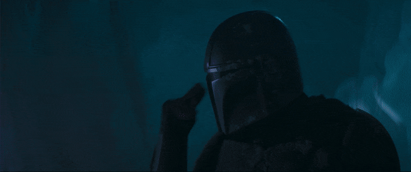
Mando’s UI is mostly icon driven with simple animations and very minor amounts of text/symbols.


Boba Fett
Boba Fett’s armour UI is very glitchy and his ship’s UI is entirely icon based.


Holograms
The holograms featured are either video based or 3D wireframes of schematics. All are projected from below through a tactile device.


Scopes
There’s a few different scopes featured here, from view finders to weapon scopes. Most involve slight range finder animations but the designs feel distinctly Star Wars and there’s some really nice subtle touches like the distortion on the rifle scope.


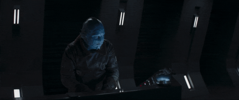
Empire terminal
The Empire terminal UIs feel nostalgically retro, almost like CD-ROM experiences from the 90s. Only the dark trooper UI looks slightly more modern as it’s dealing with a more progressive version of their technology.


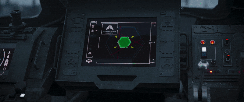
Empire Stormtrooper transport
The targeting UI in this Stormtrooper transport looks very retro with its thick outlined diagrams. The reduction of detail, chunky line work and slightly muted colour palette creates that classic nostalgic 80s/90s UI feel.


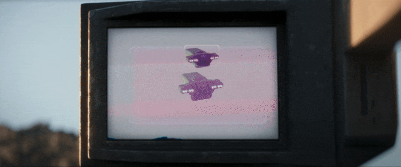
Empire Tie fighters
Again the Tie fighter targeting UI follows the same patterns as above, with the image updating in increments which reminds me of the way interfaces were done in the 80s/90s like the old Tomy retro driving game!


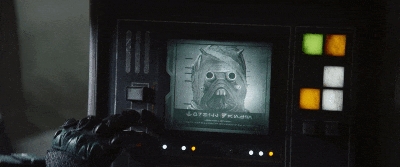
Criminal records
It’s interesting to see a greyscale interface in world with droids, holograms and spaceships. It’s a tiny screen and reminds me of a microfilm reader or some other technology that you’d have expected to see in an old library. It’s quite charming with its big LED buttons.
Check out The Mandalorian if you haven’t already, it’s a great Star Wars spinoff with a cohesive suite of retro UI.