LG OLED - Future Vision
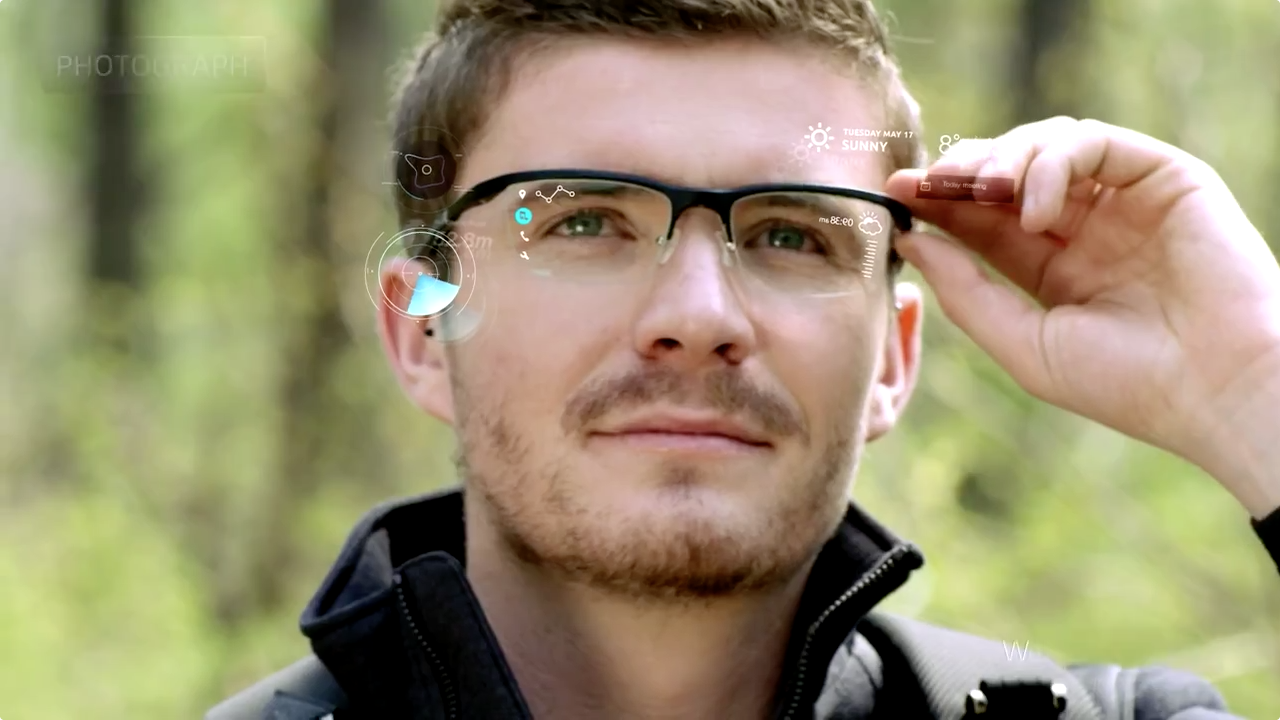
LG have released this future vision demonstrating the potential of OLED (Organic Light Emitting Diode) technology. In the same vain as Microsoft and Corning, this clip shows a variety of applications and how they can enhance our lives. The clip features curved touch screens, transparent screens, interactive video walls, a smart watch, car UI, a car HUD, smart glasses, rollable displays, convex displays and even an interactive cast :)
A lot of neat ideas are presented here but there were three in particularly that were really interesting to look at in detail.
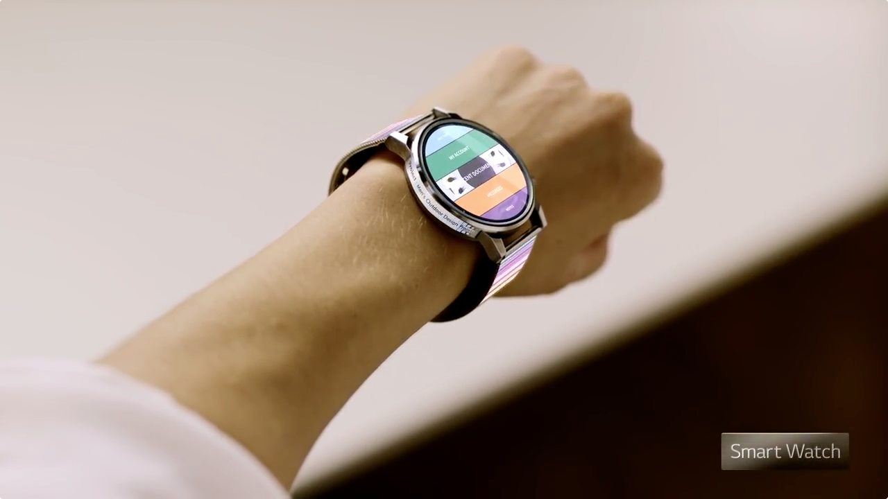
Smart watch as a universal controller
The video shows two instances where a smart watch is used as a primary controller. The way it is demonstrated makes it look much more convenient than using a smart phone. The process feels more natural, you don't need to reach in and fumble with a large phone rushing to get it out of a small pocket. But as you can see in the image, the small screen real estate is the biggest issue, for legibility, touch targets and content space. Perhaps there will be standardised guidelines to restricting content on it, like Twitter's 140 character limit.
I really love the example where the man in the car taps his smart watch to the window and initiates a video conference. It feels right and I like the theory that any surface can become a display. Perhaps a display behind the front seats would allow the man not to have to crank his neck for longer calls, but of course it wouldn't capture people's imagination as much as the window. Which is a major role for a future vision piece, not only to be a product demo but something that inspires and excites imagination.
Tiling displays
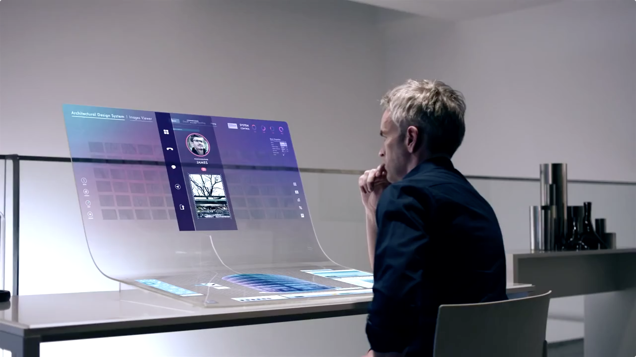
The tiling displays in an interesting concept, whereby any two displays would have a level of content awareness to be able to automatically communicate with each other. I love the look of the flexible displays, it really looks incredible and highly futuristic. It's like magic, where a sheet of paper could have all these advance functions without having any of the hardware driving it, visible.
This digital paper approach is so intriguing and I would imagine it could cut down paper waste dramatically.
What I struggle with is how the flexible displays work with the tiling display. The process is interesting but I've struggled to find a tangible benefit to it. Would it not be easier to have a screen-sharing experience and just send content from the table to the wall? I find the scrapbook-like peeling and sticking process to be very appealing but I wonder how it can be used effectively? The demo with the architect near the end of the video doesn't help. We see him sticking a large flexible display around a cylindrical pillar, which is cool but what if you wanted to add more layers, would you start piling them on top of each other? Then what would happen if you wanted to remove one of the earlier layers? I'd imagine throwing content from a screen-sharing experience would be much more effortless and manageable.
That being said the video does demonstrate the technology, and it's potential, so huge kudos to them! I guess it's up to others now to find ways to harness this potential.
Large scale interactive walls
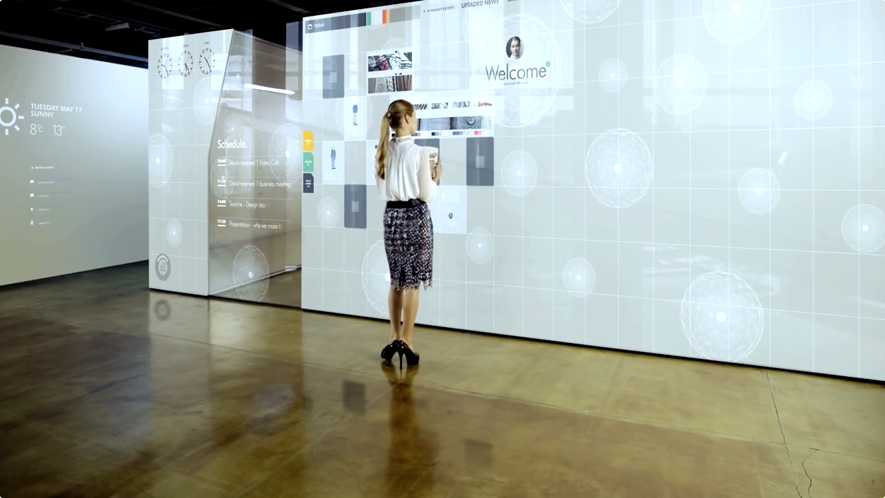
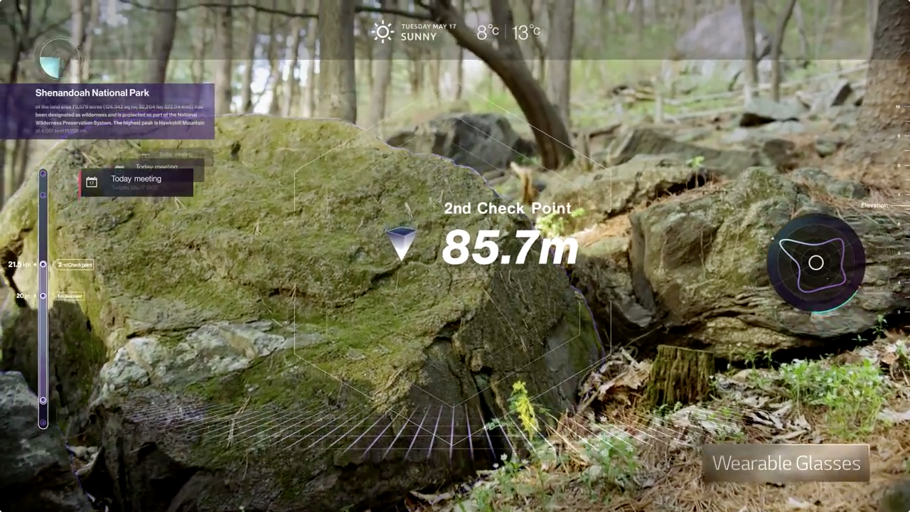
What this video does well is introduce how we can implement displays within environments. There's several examples of this and they really give you a sense of what it could be like, and they've done it in a subtle way. It's not adverts everywhere like the shopping mall in Minority Report. Instead it's subtle wallpaper with the day's temperature, or way finding content. At 0.59, the video shows how you can change the entire mood and character of an environment and how dramatic this can be.
The classroom scene is a good example of this as well. I think it's a pretty accurate prediction of the future, where blackboards are replaced by large scale interactive white boards. At the end of the class instead of cleaning the blackboard, the teacher could record the entire lesson to store or share. So instead of lesson notes you could record all the demonstrations and the explanations along with it.
Image gallery
Conclusion
The one last thing I have to mention is the interactive cast. Although I can see how a display would be useful, in this instance showing an x-ray view of the injury, I feel the interactive portion to be very strange. I would imagine someone with a fractured arm would probably not want someone tapping on the cast constantly. Even in the demo, the kid's arm seems to be rattled by the forceful jabbing of the doctor's button pressing.
The display itself and the colourful design on the cast, I think is really lovely, but using the cast as a keyboard seems really flawed and kind of silly.
Overall though, there are some great ideas in this video, which makes me excited about the future. I like that they've used restraint and presented a 'liveable future' like the movie her. It's a future that isn't too far fetched or intrusive, and one I would totally welcome.
Check it out!


