Sid Meier's Civilization Beyond Earth
Recently I stumbled upon the latest instalment of Sid Meier's award winning Civilization series, Beyond Earth. The game is set in the future and involves space travel so naturally the trailers feature glimpses of FUI. Below are three trailers each with different UI featured.
Announce Trailer - "A New Beginning"
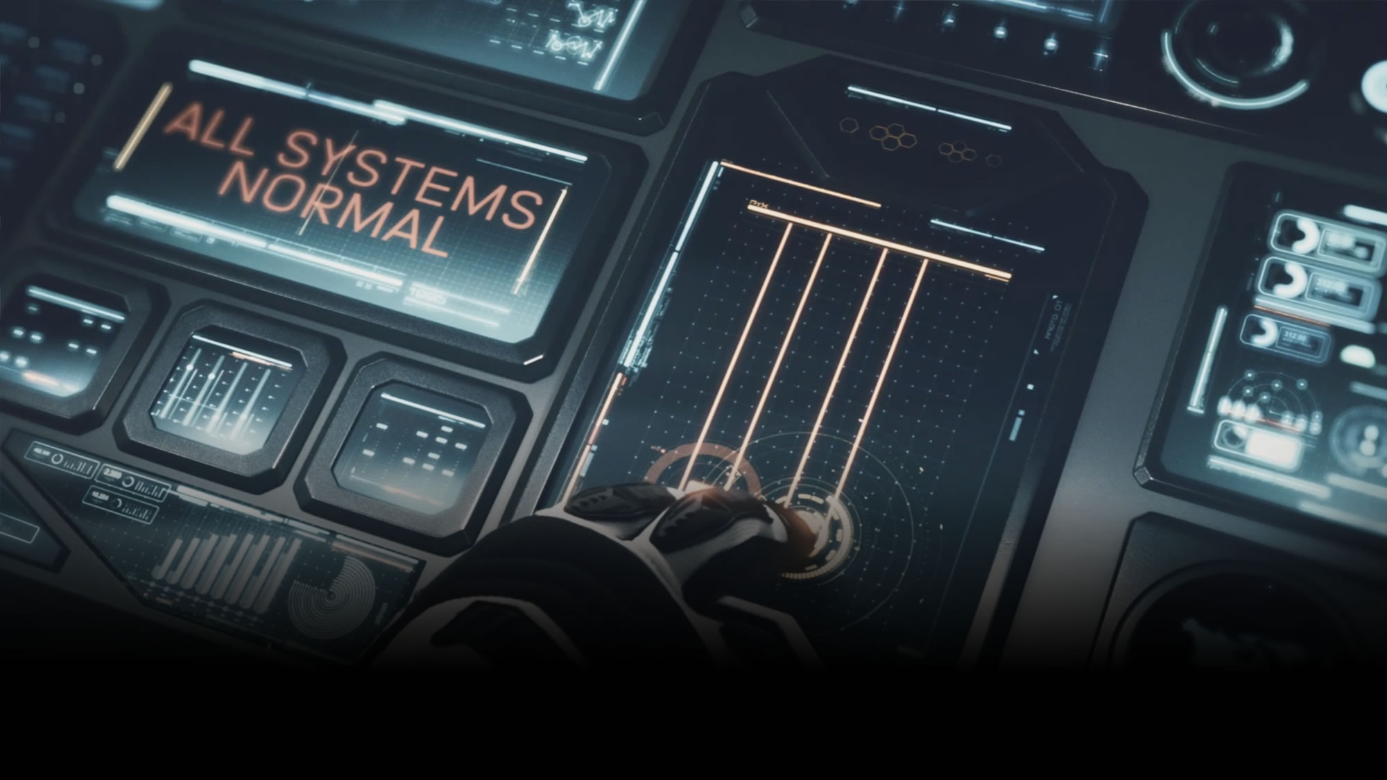
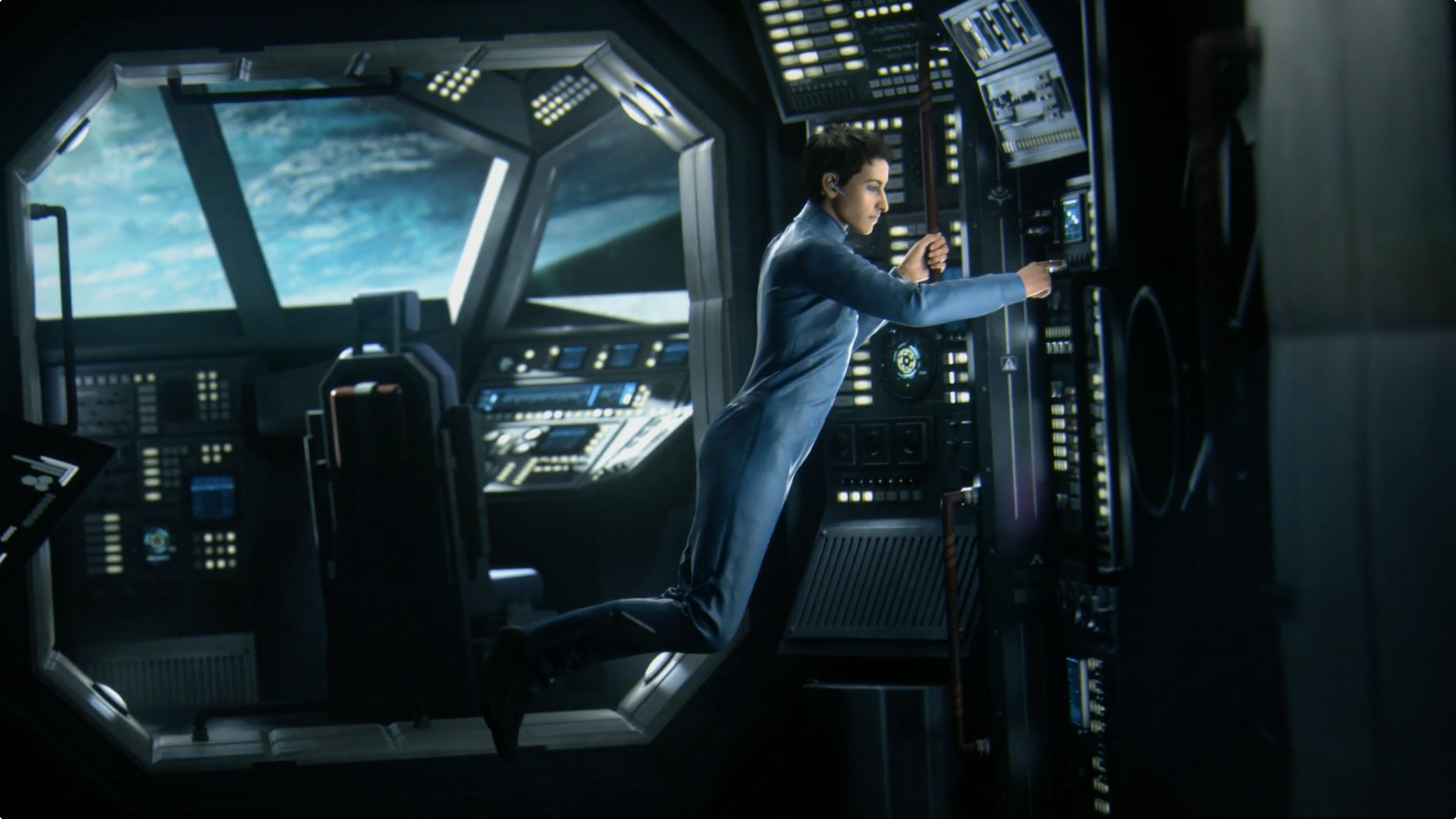
The UI in this trailer is my favourite of the three. What's great about the UIs in this trailer is the finish on them. The lighting and post production really make the UI look polished. The subtle glare on the surfaces help give the screens texture. The design of the console and the bevelled frames around the screens is a really lovely touch. It's nice to isolate each readout screen with a physical frame rather than have them all on one flat screen. It separates the different layouts without having to add more elements on the screen to divide each section.
I also really love how the type is introduced by a pair of lines as a way of getting your attention prior to the text appearing. The UI in this trailer is a really good example.
Rising Tide Cinematic
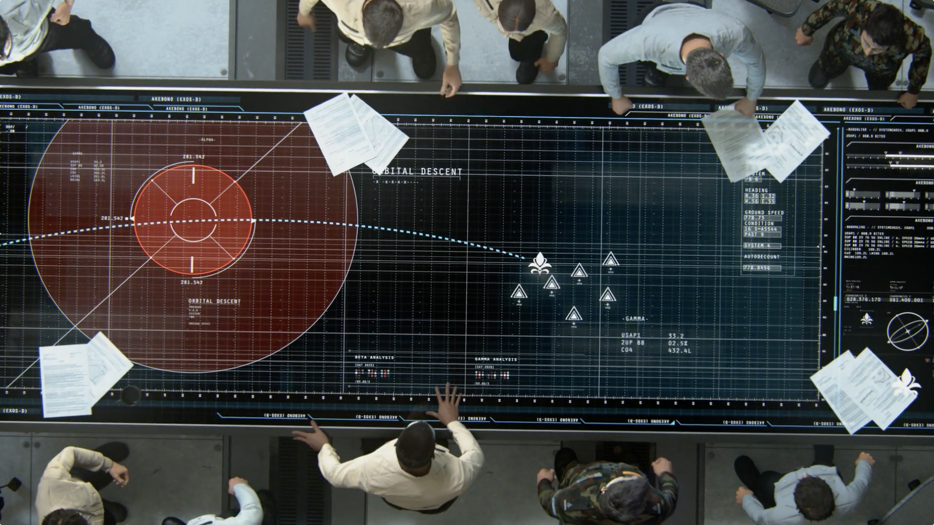
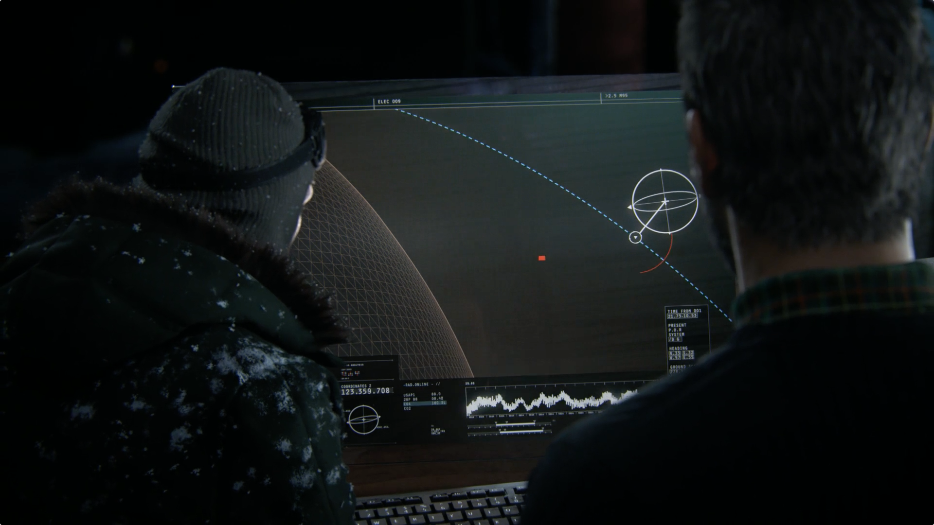
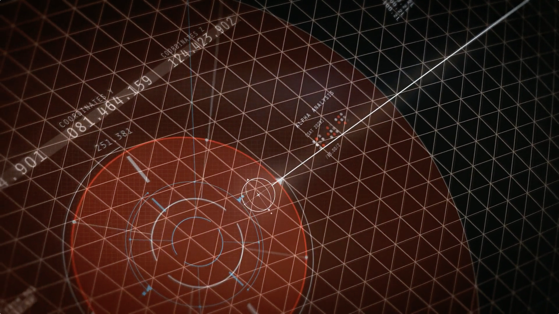
This trailer features some simulations and a large table display. The design is very clean and neat. The screen designs are quite technical but still minimalist and the linework is very confident.
Intro Cinematic – “The Chosen"
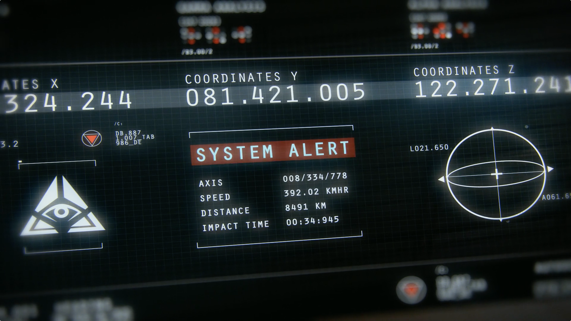
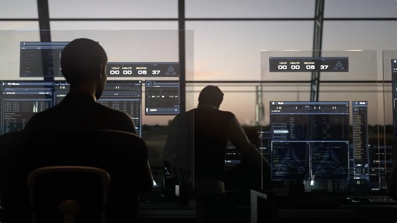
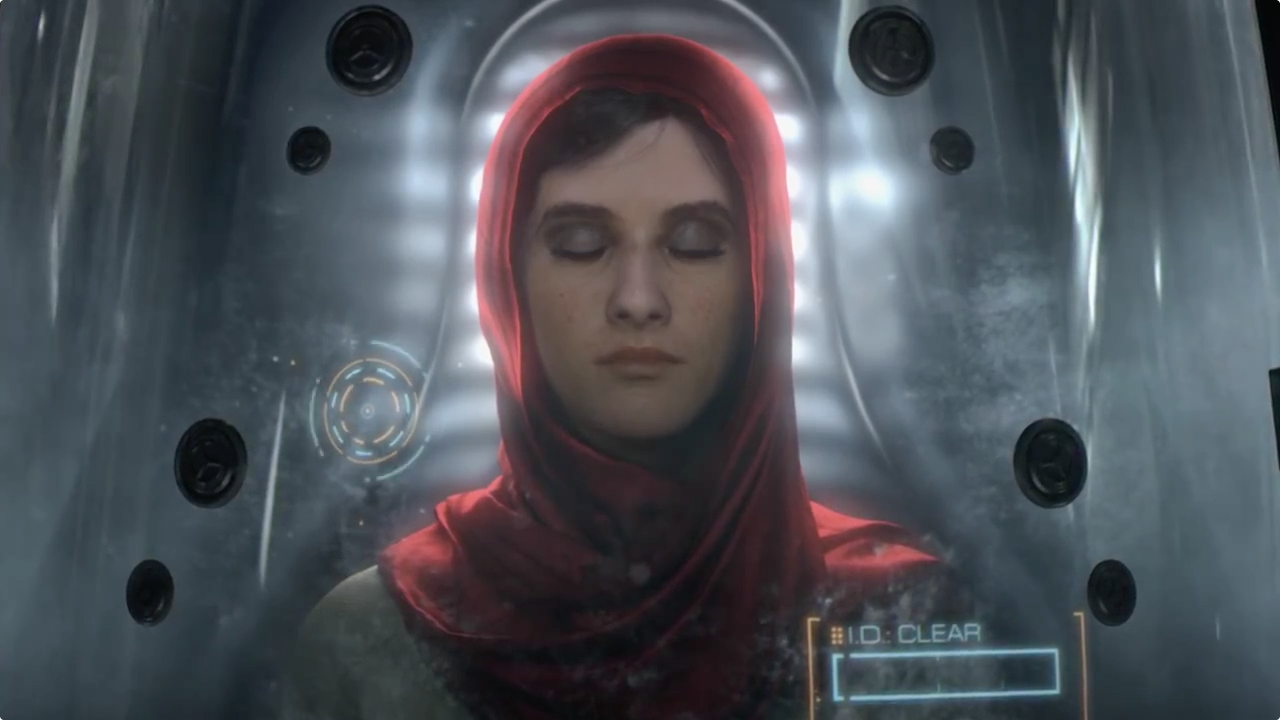
This one features only a tiny bit of UI, here's a link to skip straight to the UI.


