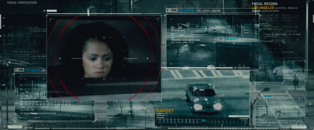
Furious 7 by Cantina Creative
Cantina Creative have generously released some breakdown videos detailing their work on Furious 7. The video above is the UI reel, and the videos below show a more in-depth look at how these were developed.
A lot insights are shared in these videos and I particularly liked hearing about the thinking process involved in the creation of each scene. From considering the different permutations of the Gods Eye to the way the LiDAR light sweeps to make it feel like the drone is hunting.
They also discuss ways of working fluidly within a large team through creating modular systems, which also helped facilitate the client feedback process. There's a lot of great industry insights here, so make sure you check them out.
God's Eye Design
I loved how the team visualised the process of the God's Eye thinking and crunching through vast amounts of data. The system of the God's Eye is organised but not neat, a lot of the processing is done rapidly and through hacking, and this was reflected in the animation and design of the visuals. It gets things done without worrying about looking pretty, and I get that from watching the video.
LiDAR Overview
This video goes through the LiDAR effect which is used in the drone POV shots. It talks about the steps involved in the process and outlines some pitfalls to look out for, along with other valuable tips from a studio with loads of experience. It then goes into a bit more detail into the software they used like PFTracker, Cinema 4D, and Plexus in AfterEffects.
LiDAR PFTrack Demo
This is basically a crash course in PFTrack, and uses a scene in Furious 7 to demo the process. They go through in quite a lot of detail about the tracking process and steps needed to set up the scene.
Pixel transition effect
This video is very close to being a full tutorial. Alan Torres designer and VFX supervisor walks through the process of creating the pixel transition effect in AfterEffects. The approach is quite clever. Once creating this effect, it can be applied in so many ways. Instead of designing transitions for each shot, the team can take this pre-established effect and apply it quickly, which also helps with consistency.
Image gallery
Not only is the work great, but it is fantastic that Cantina Creative have decided to take the time and effort to share the process with everyone. It is great for the UI design community and especially for those starting out. So a huge congrats and thank you to the crew at Cantina Creative!


