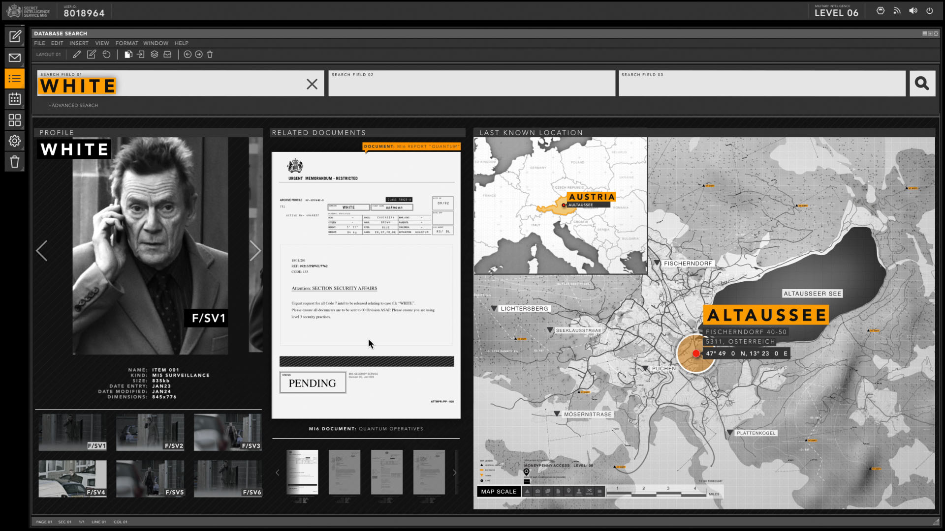
SPECTRE - 007 UI by Rushes
Here is a UI reel for the latest James Bond 007 film Spectre. It has been released by Rushes, an award winning VFX company based in London, who had been working on the project over a 13 month period.
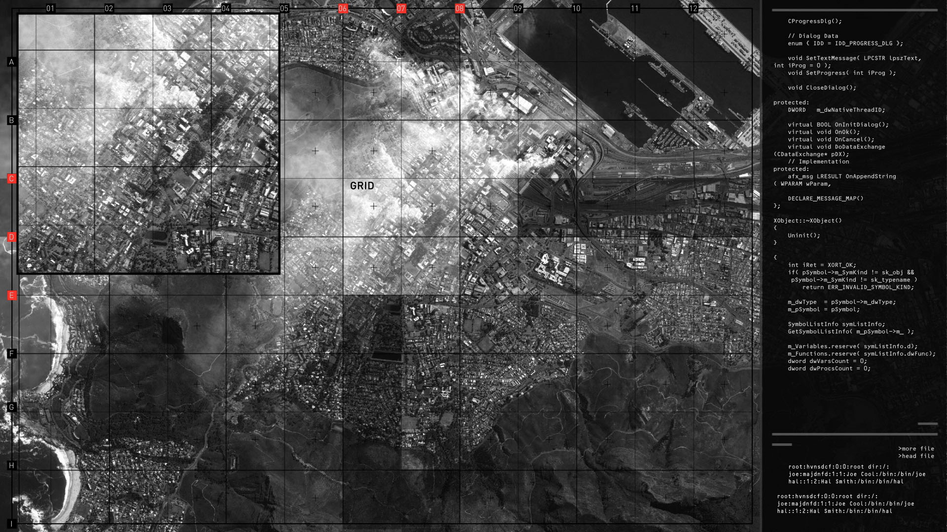
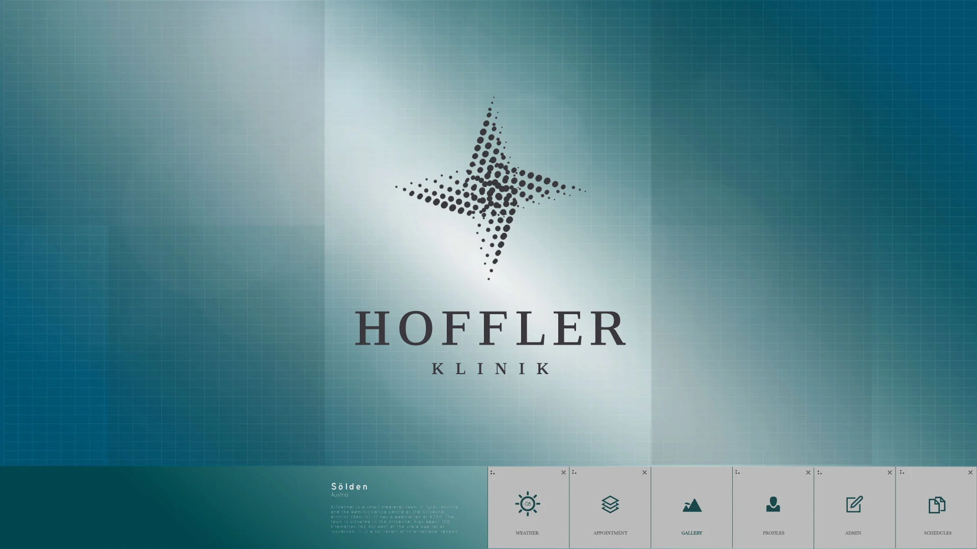
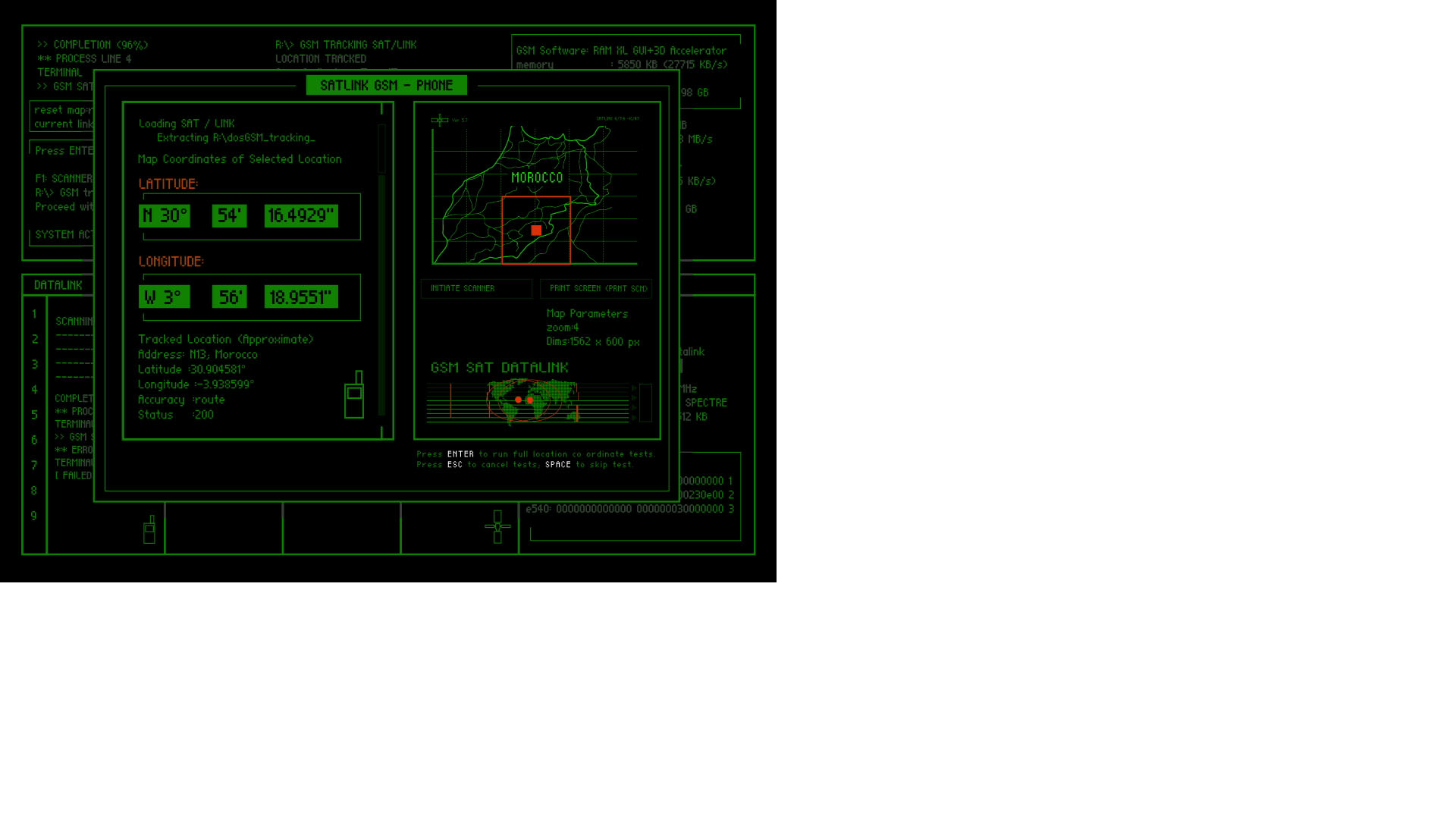
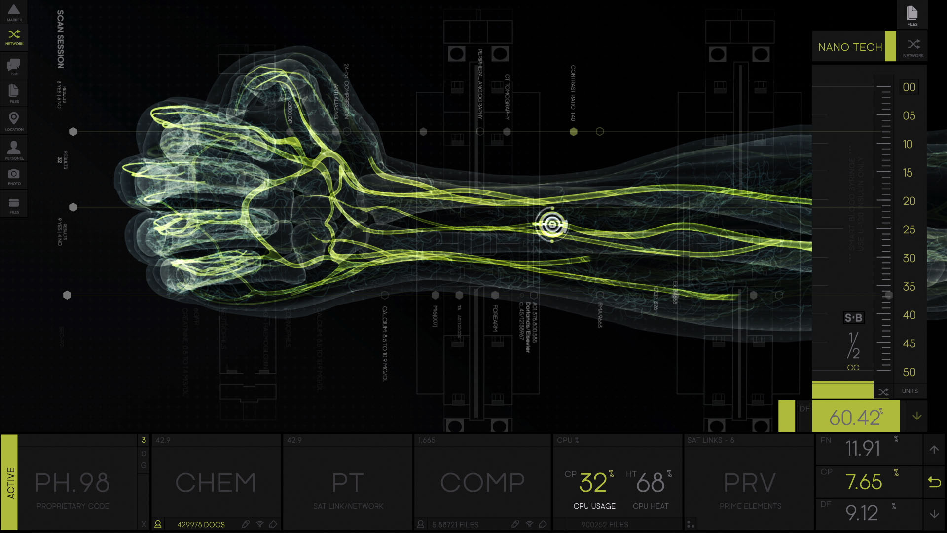
They were tasked with creating sequences for over 300 screens and across 23 scenes in the film. The expectation was to deliver designs that had a high level of realism and authenticity and depict a relatively accurate account of near-future technology. They have done this through a mix of 3D and 2D and some beautiful examples of data visualisation.
Rushes have approach this with a complex design, when I say complex I don't mean that it's hard to comprehend or convoluted. What I mean is that there's lots going on, as opposed to a minimalistic design. The screen designs feel busy, it feels like there's lots of little things at work, lots of tasks happening in the background. But it's not distracting, it just helps sell in the realism. You would expect an intelligence agency system to be dealing with large amounts of information. What they've done is explore various ways of visuallising information exchange and have established an ordered approached to analysing it.
I think they've done a great job. There are also some really beautiful diagrams and graphs in some of those screens. The Cape Town topography map and the x-ray of the hand is particularly attractive visually. Most of the work feels technical and almost scientific, but the hand is very organic, and the bright green veins look really striking.
Check it out, it's some really solid work!
***UPDATE***
- Rushes Post Production closed its doors in 2017. The video below is by Vincent who also worked on the UI for Spectre.


